Why Packaging Colour Is Strategy, Not Just Design

Walk into any Coop or Migros and play this game: cover the brand names and try to guess what products do based on colour alone. That green shampoo? Probably “natural” or “plant-based.” That black sports bar? High in protein. That bright blue milk? Low-fat.

The accuracy rate is surprisingly high. And research backs this up: studies show that people make a subconscious judgement about a person, environment, or product within 90 seconds of initial viewing and that between 62% and 90% of that assessment is based on colour alone.

But this is not coincidence – it’s learned behaviour. Consumers have been unconsciously trained by decades of consistent colour coding across categories. And when that training works in your favour, it’s powerful.

Who Decided Green Means “Natural” Anyway?

No secret committee handed out colour assignments. Instead, these codes evolved organically – shaped by market leaders, consumer psychology, and cultural associations.

Think about it: Coca-Cola didn’t just make red their brand colour; they made red the cola colour. When Pepsi wanted to differentiate, they went blue. Now blue says “cola alternative” across dozens of countries… Once these associations stick in consumers’ minds, they become the invisible language of the shelf.

Smart brands don’t pick colours they like, they pick colours that work.

When Breaking the Rules Works

But here’s where it gets interesting: these “rules” are not laws. They’re conventions that can be strategically challenged.

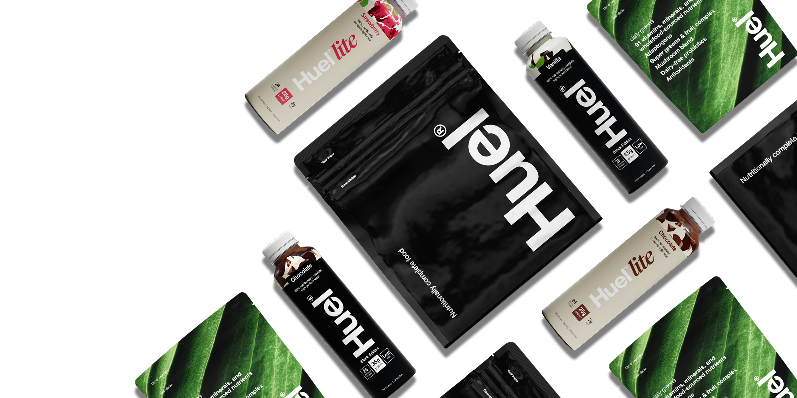
Take Huel, the meal replacement brand. Most protein products scream masculinity with black, red, or aggressive fonts. Huel went stark white with clean typography. Risky? Absolutely. But it perfectly matched their science-backed, gender-neutral positioning.

Same with On Running. While most sports brands lean on bold colours and heavy graphics, On chose minimalist white and soft grey palettes. They broke with the aggressive “performance” aesthetic, instead going with lightness and innovation – perfectly aligned with their “running on clouds” brand promise.

The key? They knew the rules they were breaking and had a compelling reason for it. Harvard Business Review research on brand differentiation supports this approach: successful brands either follow category conventions perfectly or break them strategically with strong narrative backing.

Our Packaging Colour Checklist

So how do brands get their packaging colour right?

1. The 5-Second Shelf Test
Place your mock-up among competitors. After 5 seconds, what do people think it is and expect from it?

2. The Category Fit
Does your colour align with what’s expected in your product category – or are you fighting an unnecessary battle?

3. The Cultural Check
Even within one country, meanings differ. If you expand internationally, testing becomes critical.

4. The Sustainability Scan
Green, beige, or kraft tones set eco-expectations so be ready to prove your claims.

5. The Brand Promise Alignment
Does your chosen colour reinforce your story and values or send mixed signals?

Smart brands don’t pick colours they like, they pick colours that work. Get in touch with us today and let’s crack the colour code of your next packaging design.

Text credits: ARD / agi

Images credits: Huel / On

Let’s crack the colour code of your next packaging design.
Get in touch!

Get in touch!