Holiday packaging done right

It is definitely that time of year again. From the streets and storefronts that shine bright, to the tunes that lull the radio waves, to the packaging of the foods we’re about to eat our fill of — Christmas is around the corner, loud and clear. Year after year we wait for this time to be transported to another world – a world of wonder, magic and joy. And to fully get into the holiday spirit, we buy the marked-up limited edition Christmas M&Ms pack and find ourselves reaching for that more expensive grocery bag with the cute reindeer design on it.

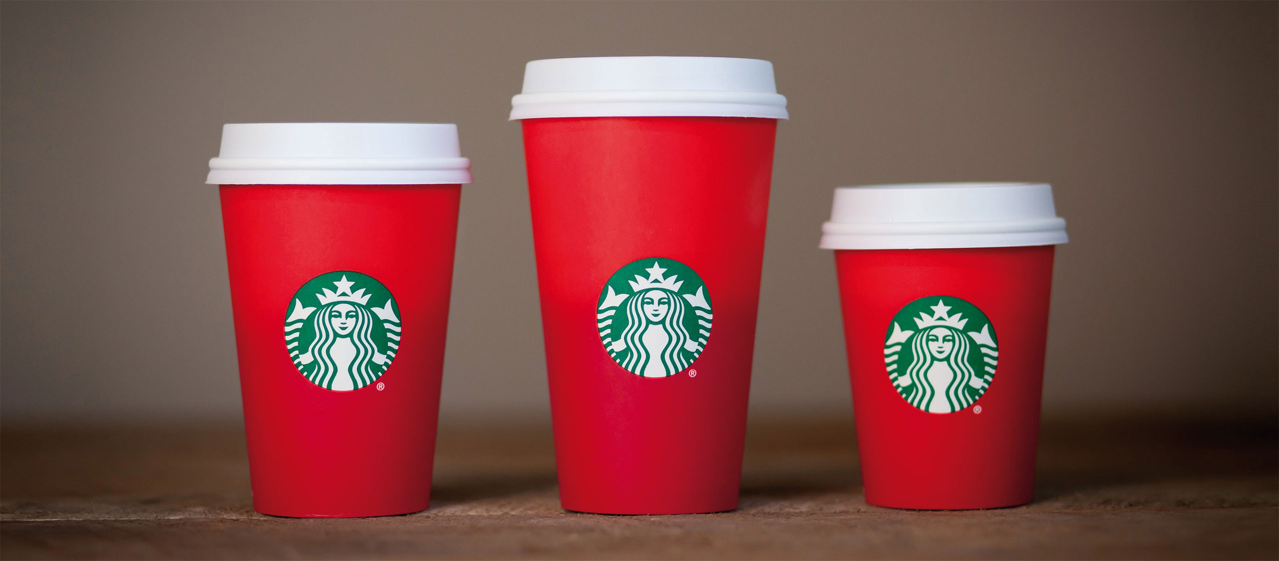
As I write this article, I’m drinking from my red holiday Starbucks cup, the one that caused such a massive social media outrage due to its plain, no-frill look. Some people linked it to a deconstruction of Christmas, others called it nothing less than an attack on Christianity. All because one company decided to no longer adorn its cups with holiday patterns.

Packaging has never been so powerful.

This proves once again that packaging has never been so powerful.

Surely mega-chain Starbucks must have considered that their cups’ design — or lack thereof — wasn’t going to go unnoticed. Maybe it was orchestrated in an effort to differentiate from the mawkish and ubiquitous snowflakes, candles, and gingerbread men designs out there. Maybe it just does a better job relaying the brand’s premium pricing to an exclusive target market. Or maybe Starbucks is really going minimalist – like their most recent logo redesign may suggest. Whatever the reason, it’s clear that Santa’s already given the company its Christmas present with all that free publicity.

Coffee drinking brand managers click here to see the evolution of Starbucks’ red cups over the years.

Text credits: ARD / agi

Images credits: Starbucks

We can help you create your next holiday packaging.
Get in touch!

Get in touch!