3 ways to make packaging design stand out

Packaging design builds your brand – at least at the promotion and sales stages. But creating the right design can be a challenge. Not only does it need to stand out in a busy marketplace, it needs to tell your brand story and align with your brand purpose. Let’s look at 3 approaches to create packaging design that will get your audience’s attention and set the stage for increased sales.

1. Photogtaphy and illustrations

One of the best ways to create outstanding packaging design is to use photography as the starting point. For this strategy to work, it’s worth investing in a professional photographer. Especially for industry segments like food, where nothing can amplify taste appeal more than high-quality photos. When Studentska got in touch to design the packages of their Summer Limited Edition, we made photography the hero for shelf impact and enhanced brand image.

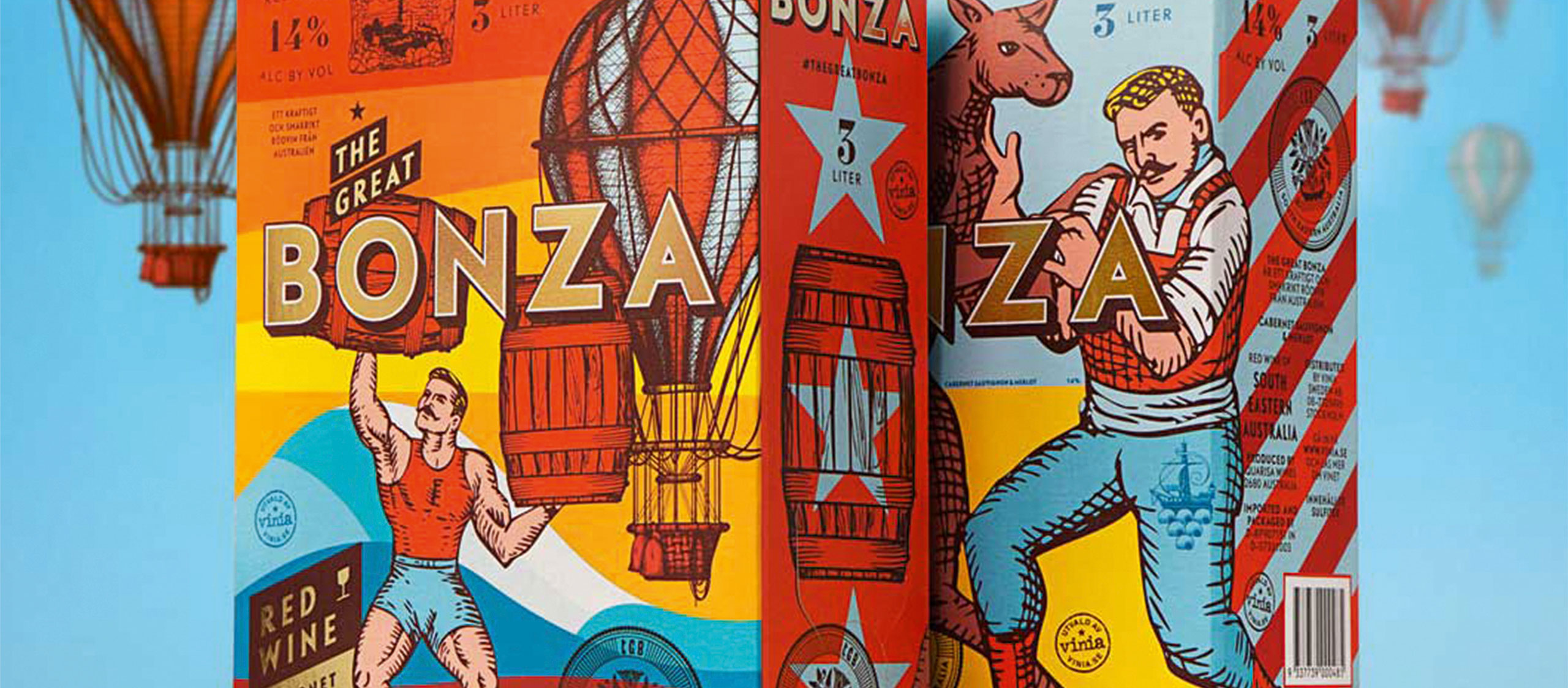
Custom-illustrations can create just as much effect. In fact, they have a unique ability to make your brand personality come across in a memorable manner. Australian brand The Great Bonza sells their red wine in vibrant boxes featuring playful sketches of circus people and boxing kangaroos – something sure to get attention and get conversations started at the dinner table.

Get your audience attention.

2. Logo design

Although every packaging would print the brand logo somewhere, sometimes it’s the logo itself that can be the foundation of the design. While some brands show nothing but a big logo, others pick subtle elements of it and lump them together into a cohesive background. The Heineken aluminum can is a good example of how much life a simple logo can bring to packaging design. Even industry segments that have traditionally preferred subtle and understated logos – think luxury brands— are now increasingly going for bold, empowered logos out in the front.

Reinforcing the memory structures.

3. Brand pattern

Every brand aiming for the consumer market should have an official pattern. In packaging design, the brand pattern comes in handy to reinforce the brand’s identity and favor recognition. Perhaps in a move to anticipate the stricter branding regulations coming into effect worldwide, Marlboro gives its red chevron pattern center stage on the pack – almost to the point of eclipsing the brand name altogether. This color and shape configuration not only gives the brand powerful shelf standout, it reinforces the memory structures associated with it.

At ARD, we think packaging is fun – not only the design but also the strategy. Contact us today and bring your creative campaign to life.

Text credits: ARD / agi

Images credits: United Power / Bloomberg

Bring your creative campaign to life.
Get in touch!

Get in touch!