A revitalized aesthetic
In order to make the Youth Olympic Games a true creative laboratory, Lausanne 2020 was seeking to create a new sports platform for young people by actively involving them in the creation and organization of the event.
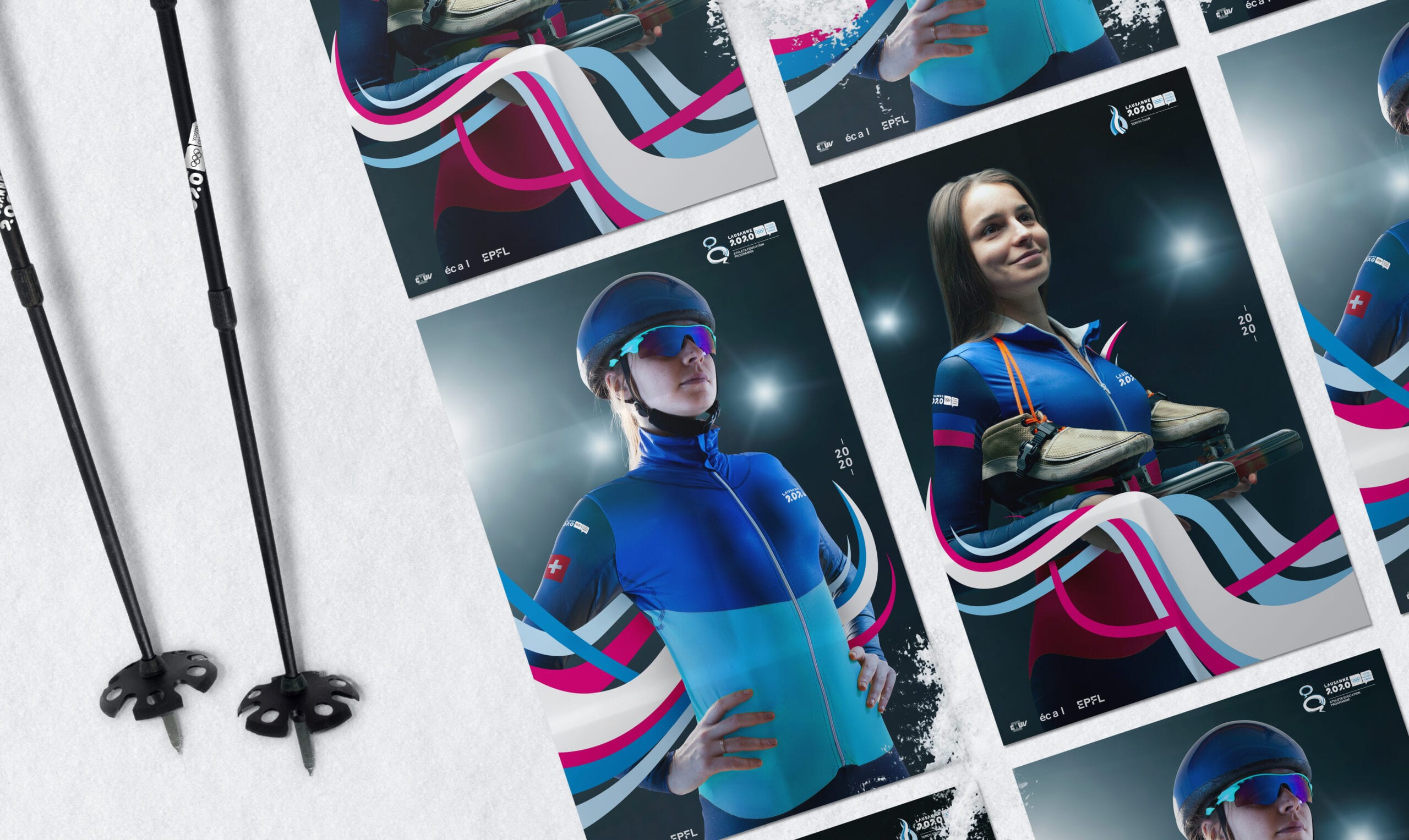
The core concept
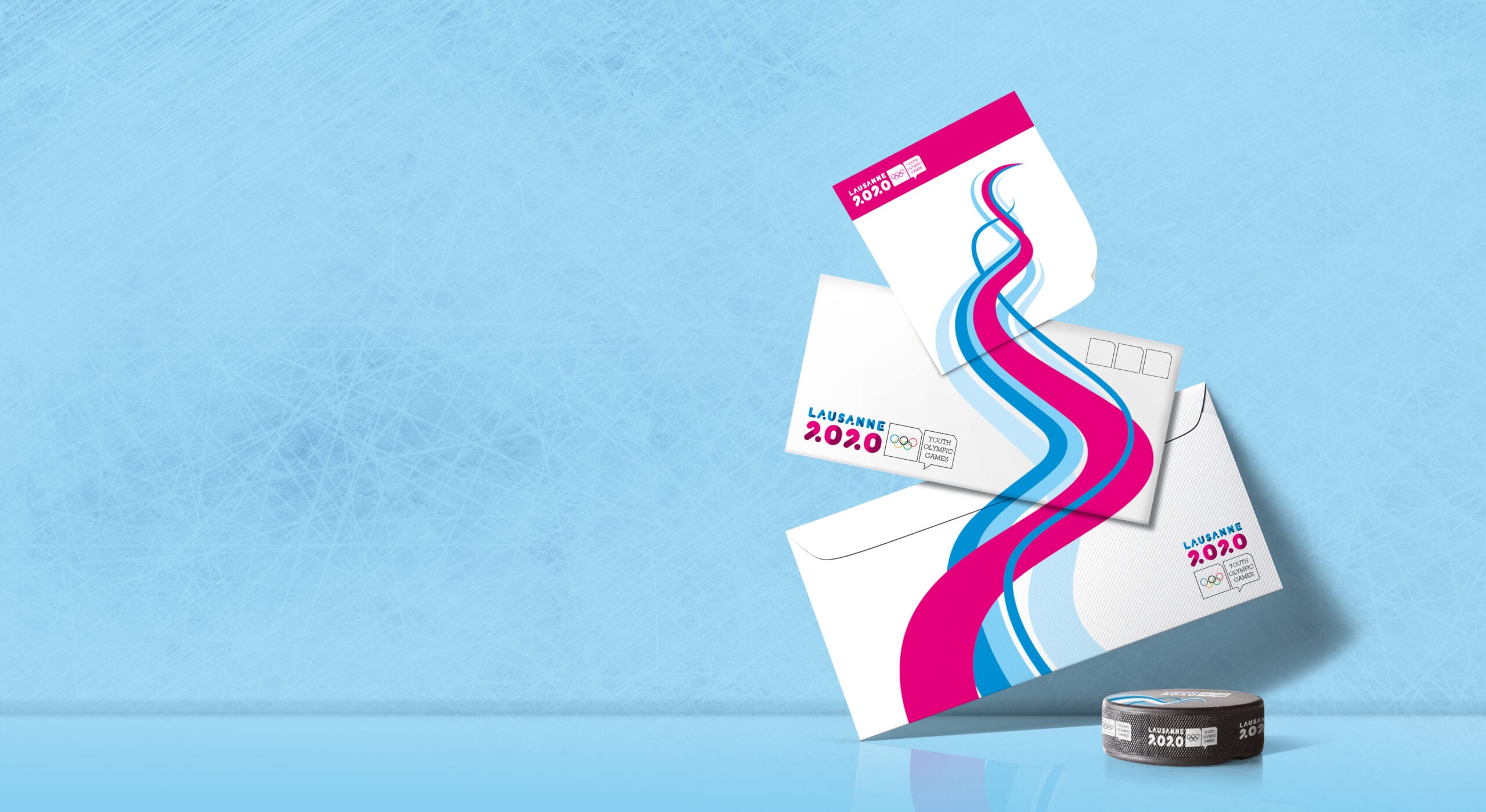
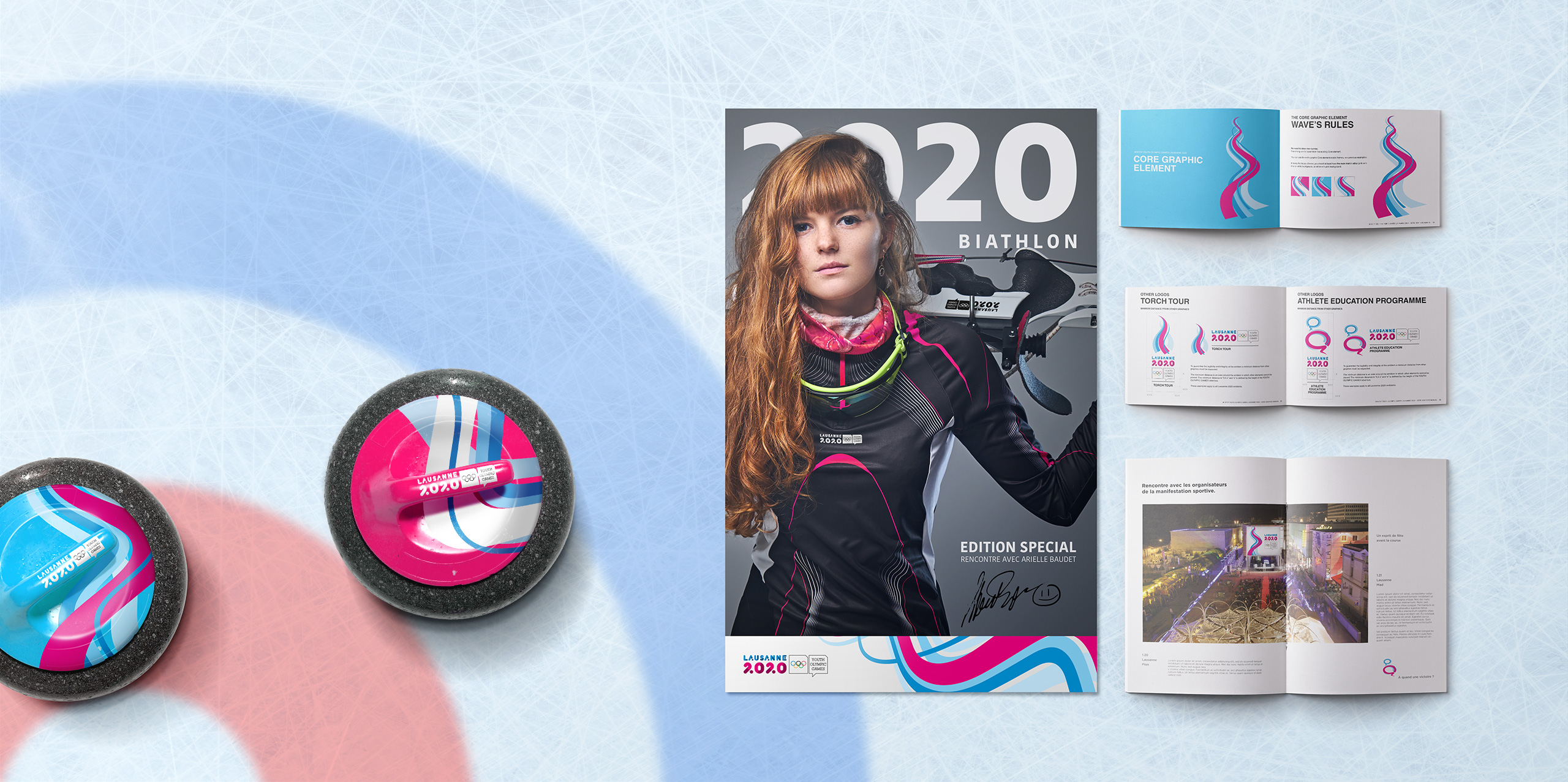
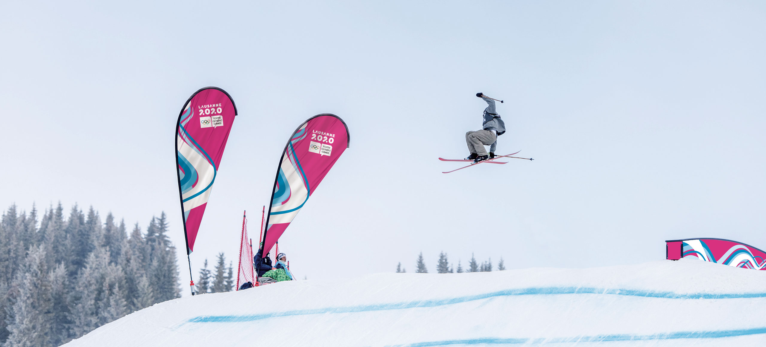
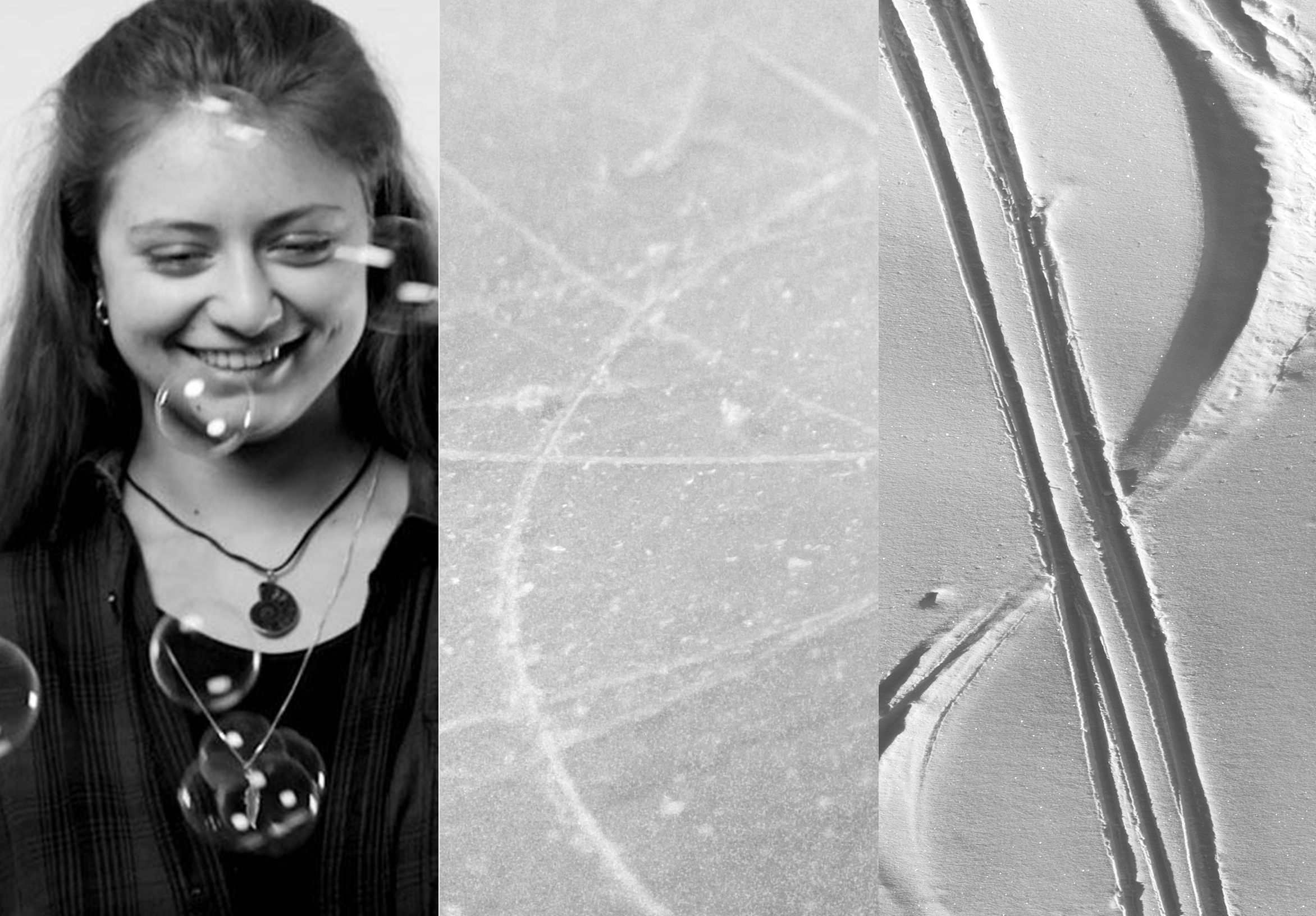
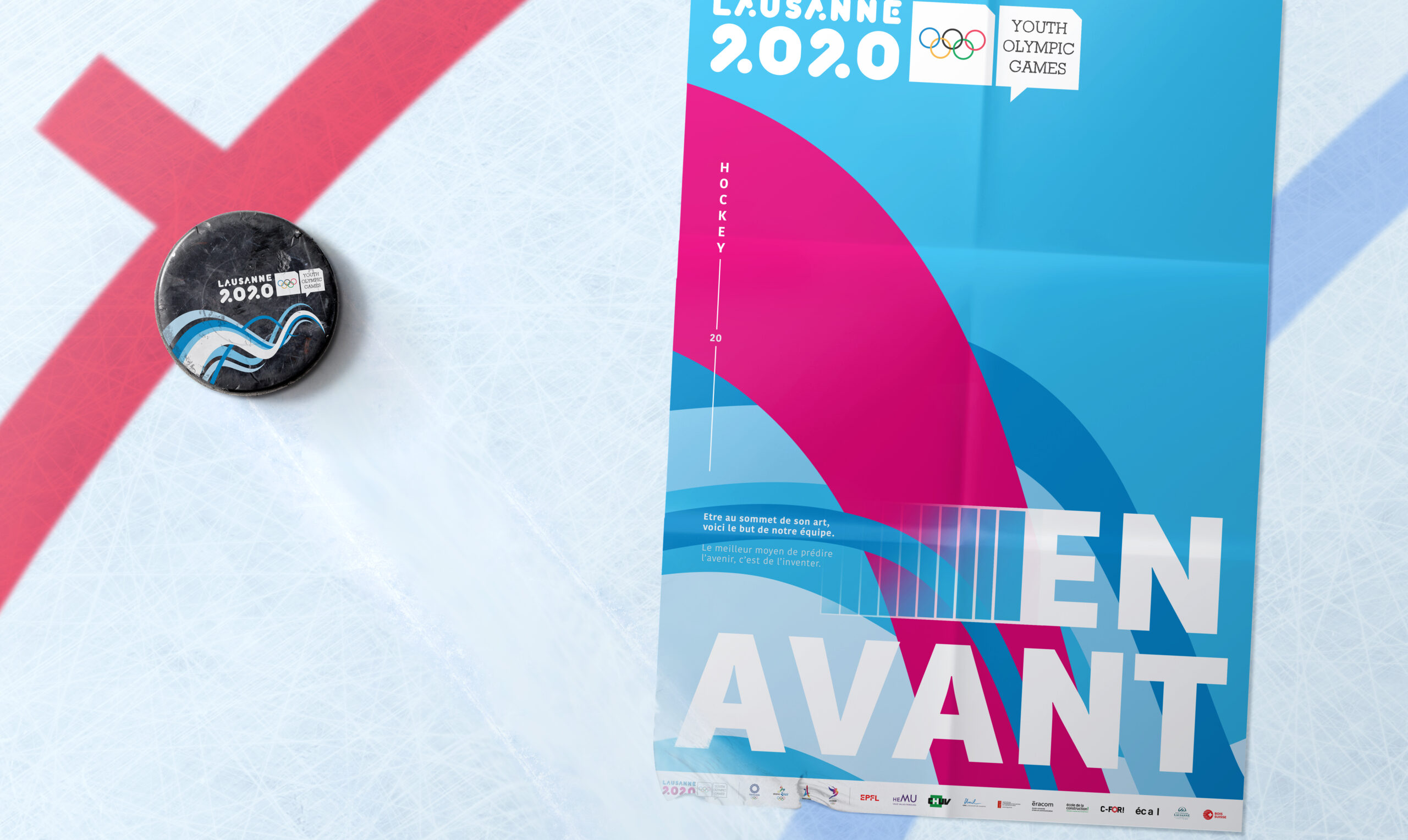
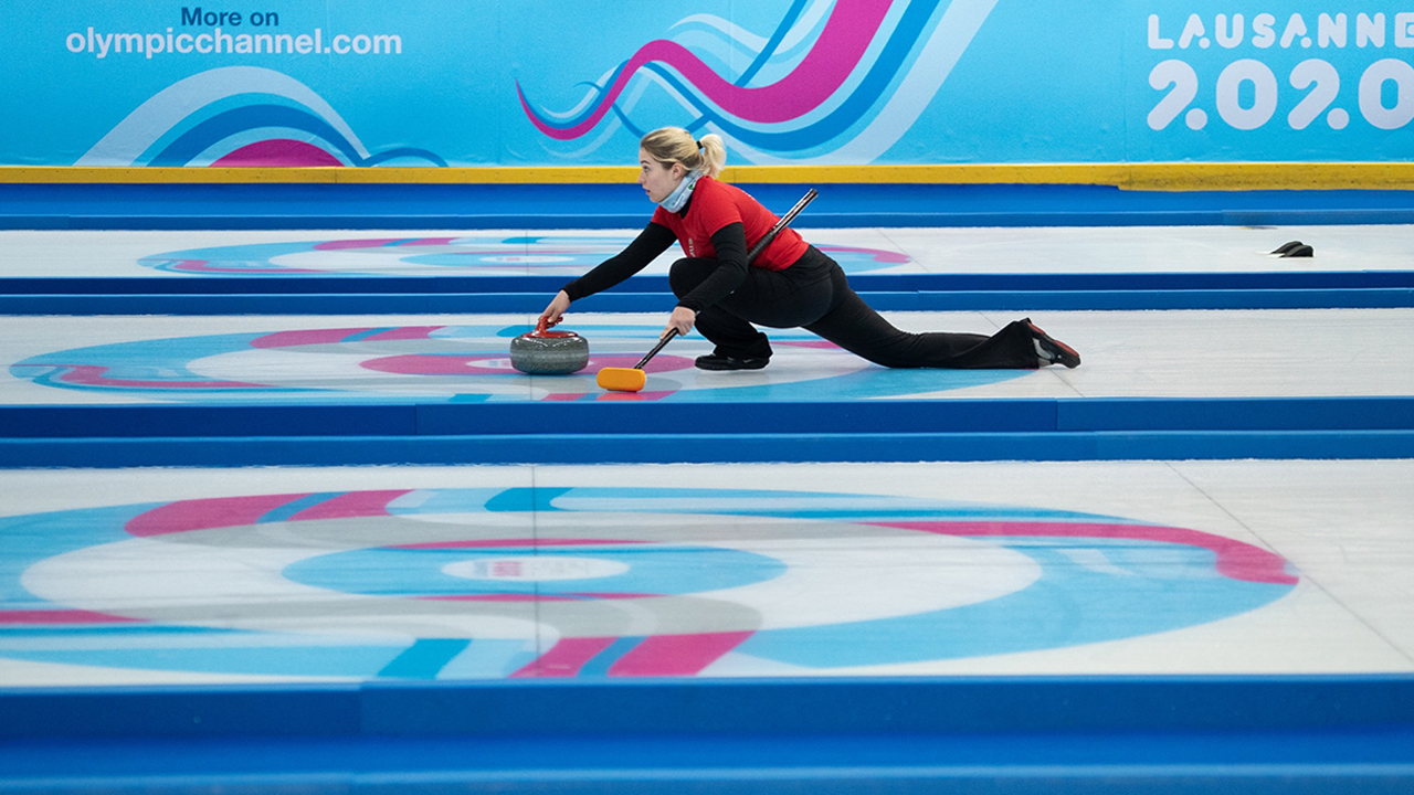
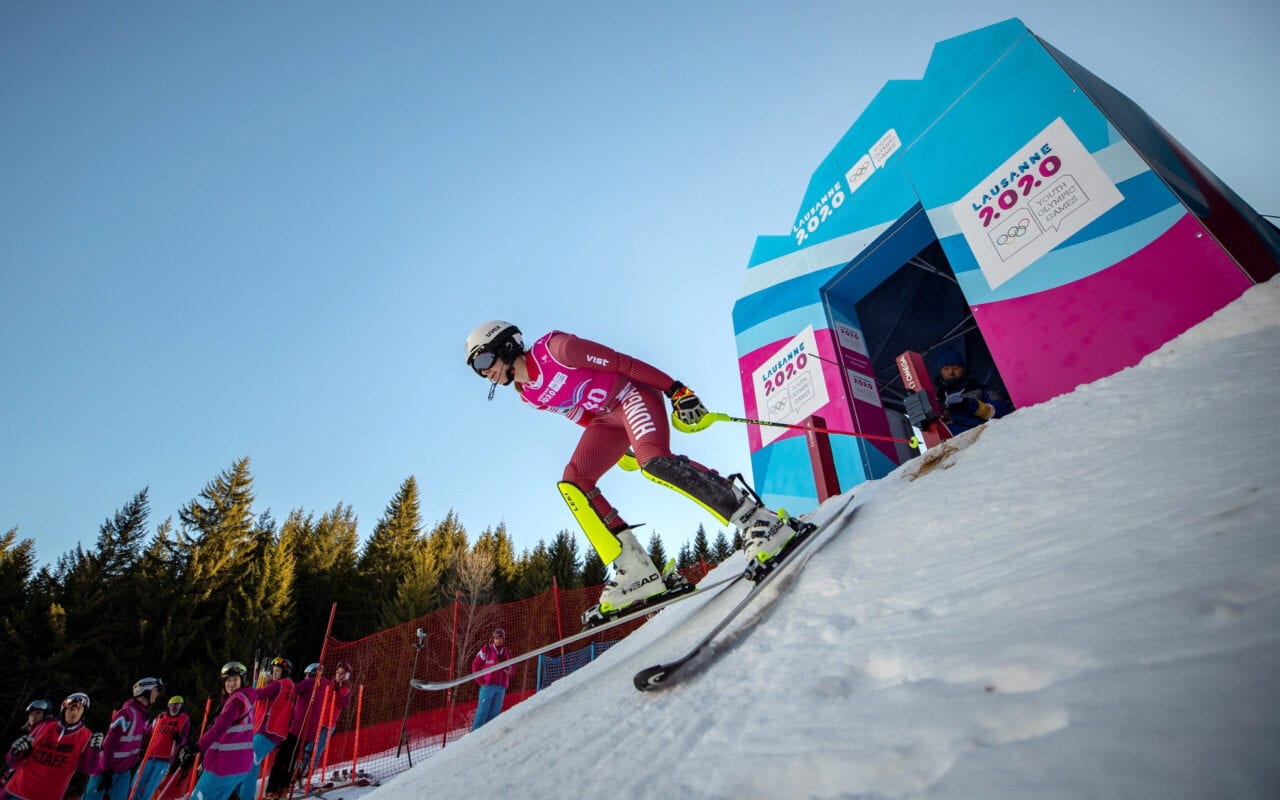
Created by our talented third year apprentice, Elsa Bersier, the “Ripple” concept was selected by the Winter Youth Olympic Games Lausanne 2020’s committee. The lines represent the tracks left behind on the snow or the ice by skis or skates, creating a modern and sleek design system.


Colored with meaning
The original colors of the Lausanne 2020 logo were to be used, but we created variations of the branded blue, to better deliver their message of plurality and diversity, accompanied by a single and powerful magenta trace. Together, they evoke the spirit of competition and the joy of sport.
Working local, thinking global
Collaborating so closely with the Olympic Games community and working on a project with international visibility was an enriching experience for our apprentice Elsa. We strived to offer the best guidance and direction to deliver a well-polished branding.
Translating the brand’s DNA
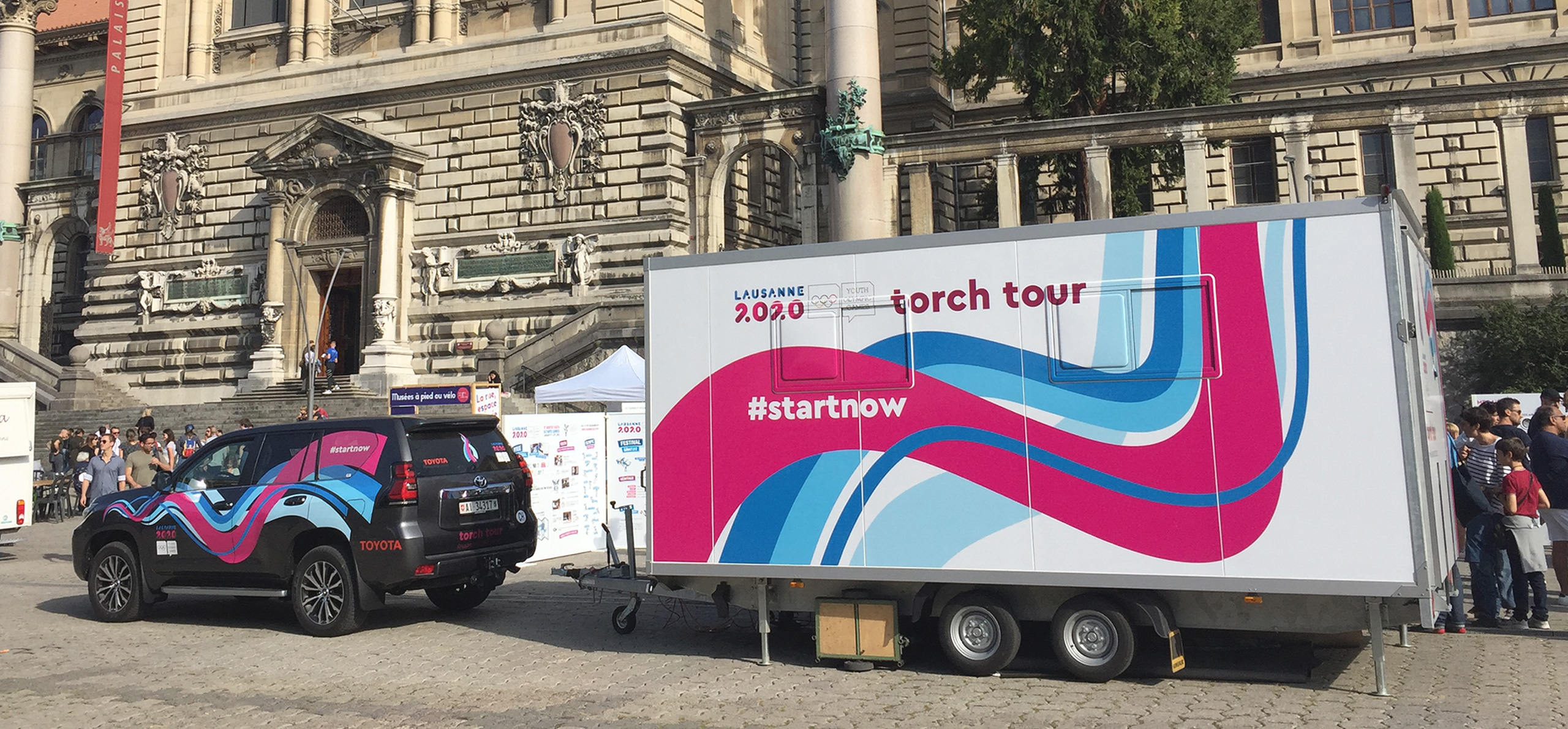
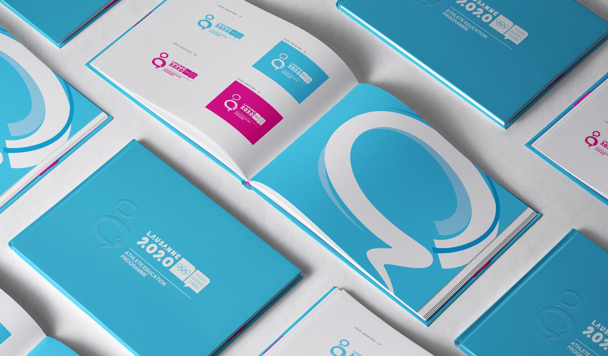
As part of going forward for the brand’s need, we designed a logo for the Torch Tour and the Athlete Education Program. The flexibility of the concept allowed us to translate the brand’s DNA into a set of meaningful logomarks to illustrate each entity.
Bringing youth on the front stage
Our design takes out great inspiration from the Winter Youth Olympic Games values. Colorful and modern, attractive and dynamic, this project has been a key platform to empower our local youth.