Color
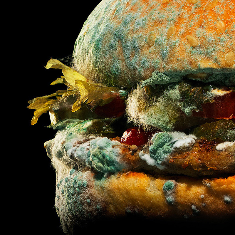
We’ve already seen in this blog that color generates the most immediate emotional response and this explains why brands are going an extra length to try to protect, even register their color assets.
28 February 2018

The human mind sees, imprints, and recalls sensory information in a specific order. In packaging design, this means that some attributes are perceptually more important than others. This quick outline comes in handy when evaluating artwork that makes a pack efficient.
We’ve already seen in this blog that color generates the most immediate emotional response and this explains why brands are going an extra length to try to protect, even register their color assets.
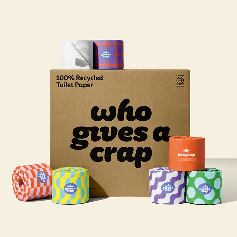
Coming in at a close second, we have shape. Not only is shape a strong differentiator, it can also be useful at signaling the category a product belongs to – toothpaste packed in a tube is just quicker to spot.
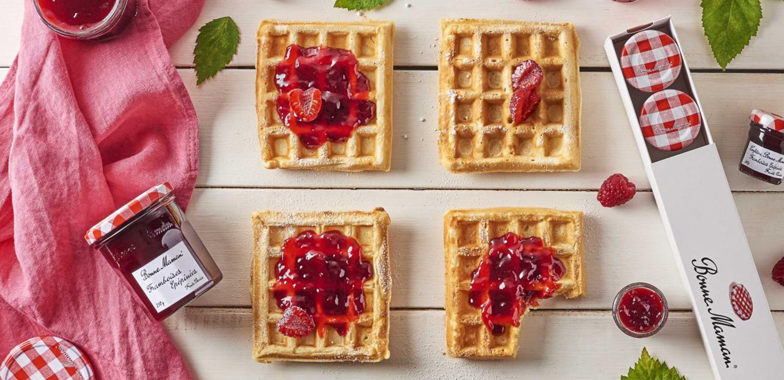
The third most efficient visual attribute is the use of symbols. Shoppers intuitively gravitate to familiar symbols to help them navigate the shelf – be it logos or icons. Symbols play a key role in product segmentation and are an effective tactic to add emotion.
To drive sales in the store aisle, brand owners need to optimize on-shelf navigation, favor product recognition, and avoid consumer confusion. Contact us today to find out more.
Text credits: ARD / agi
Images credits: Guidedcraft / Bonne Maman

Get in touch!