Repositioned pioneer
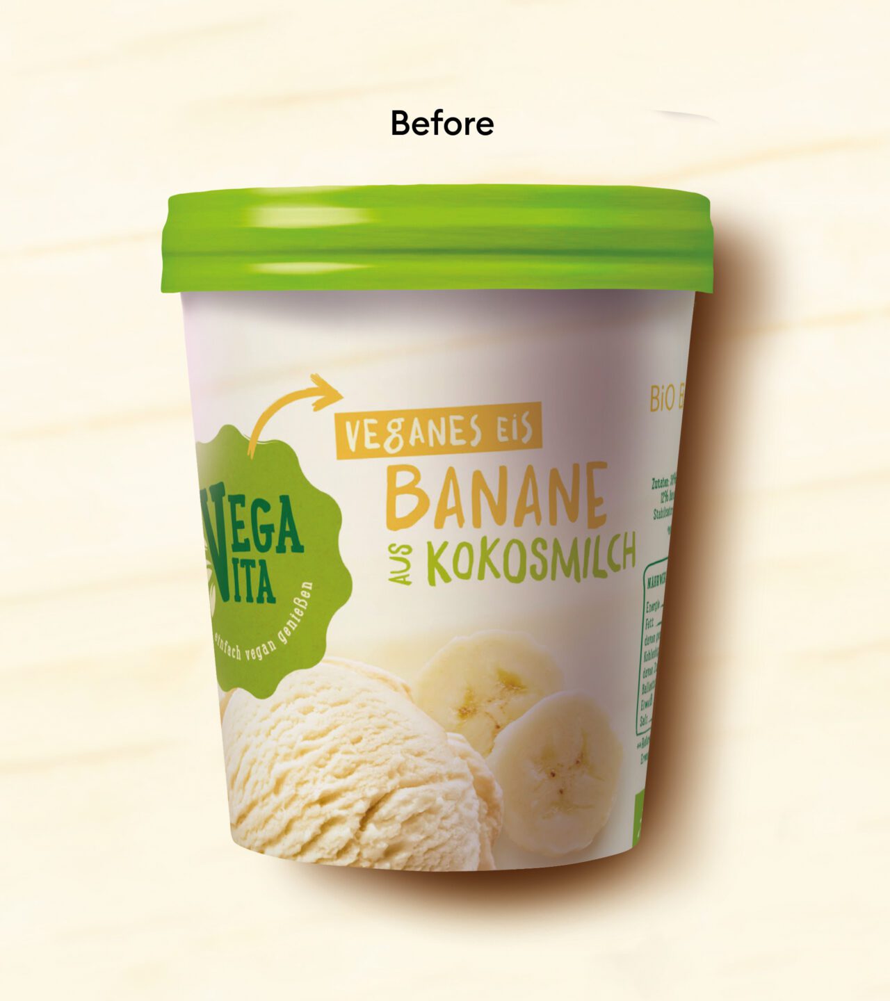
The retailer Billa, market leader for vegan products in Austria, wanted to completely relaunch its Vegavita brand, to live up to its role as a pioneer and set new standards for the sector. The repositioning included switching from ‘vegan’ to ‘plant-based’, with the aim of appealing to a new, young and trendy target group.
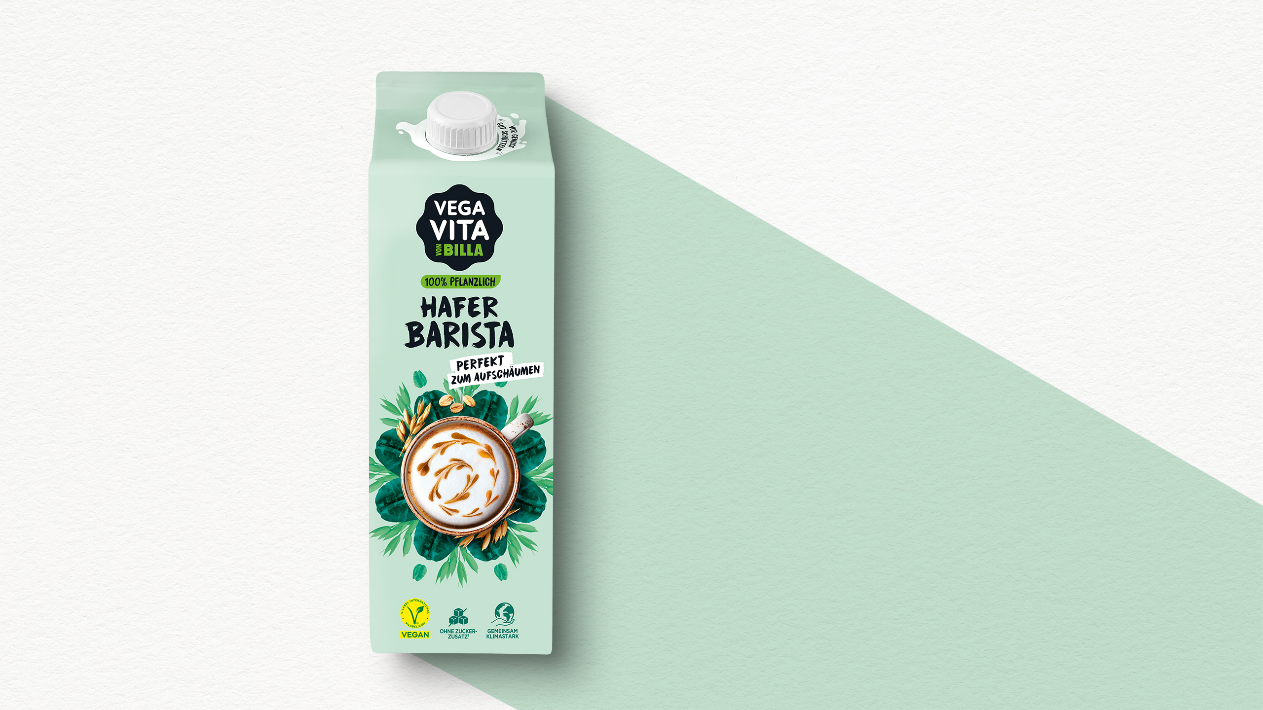
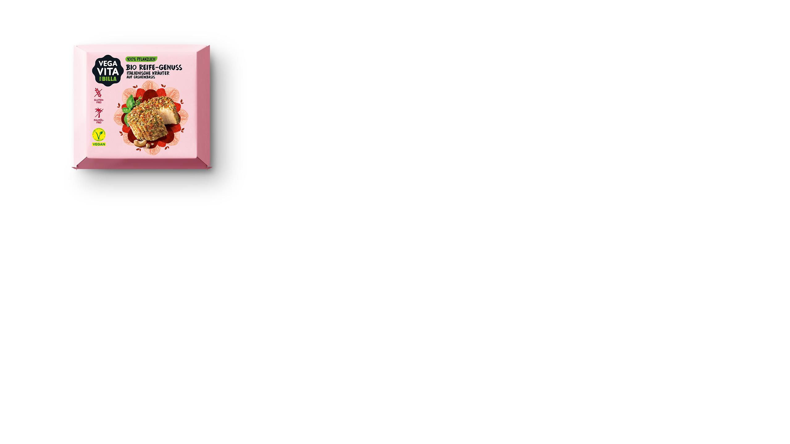
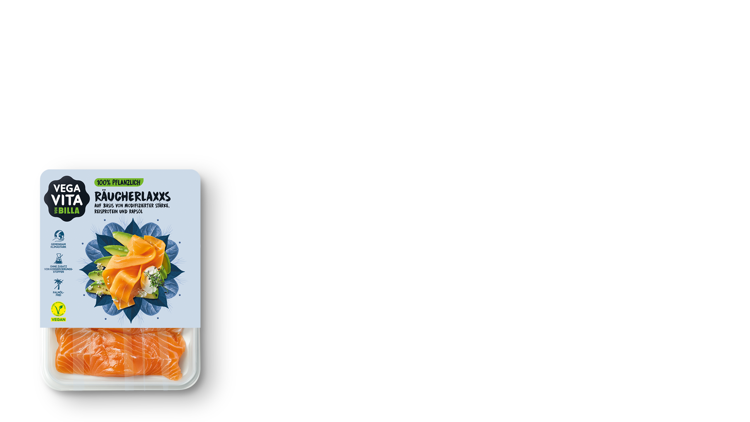
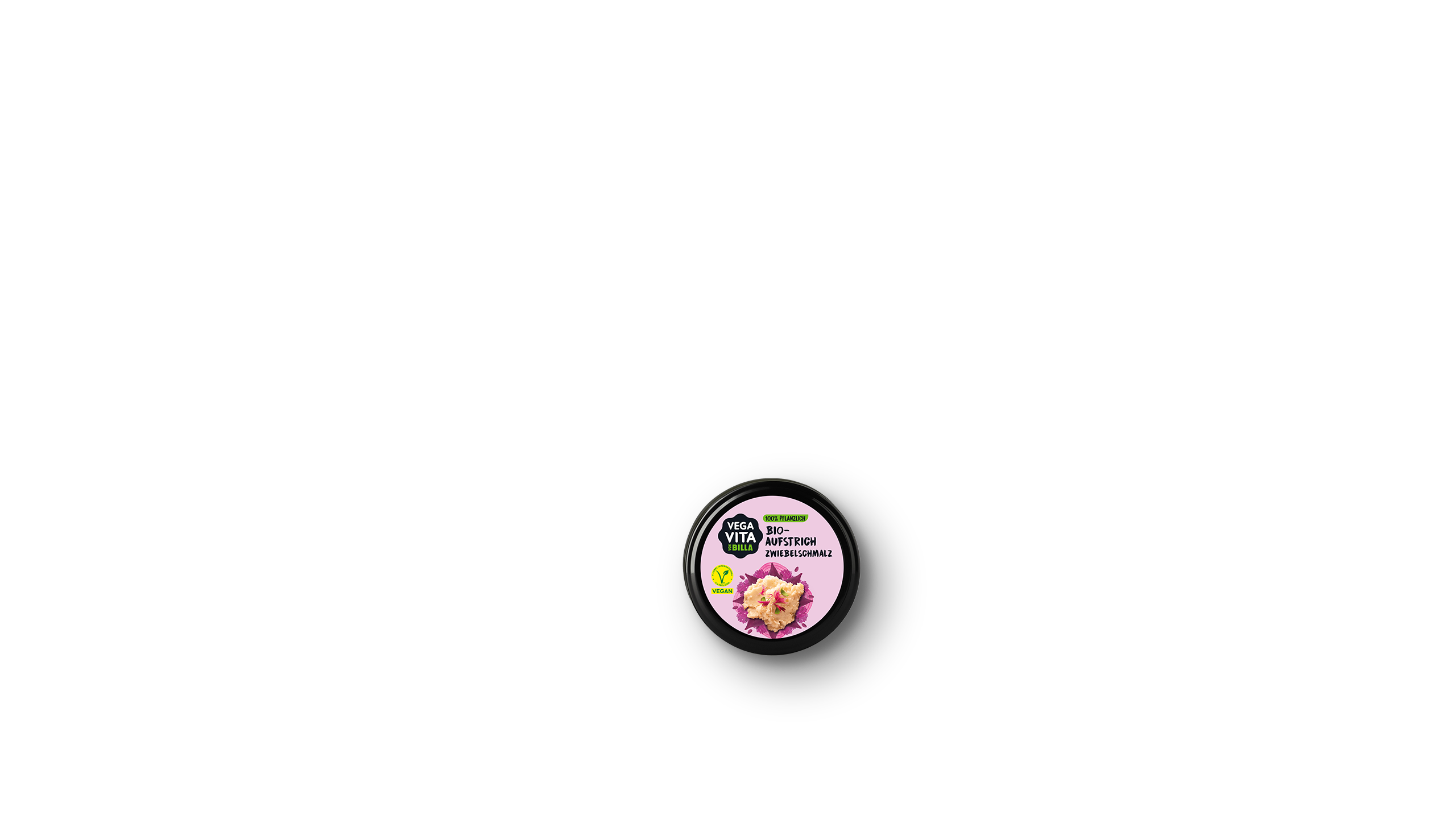
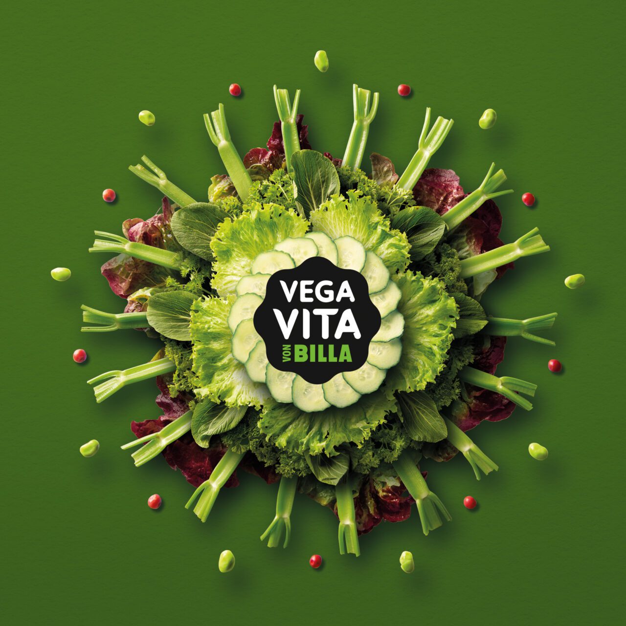
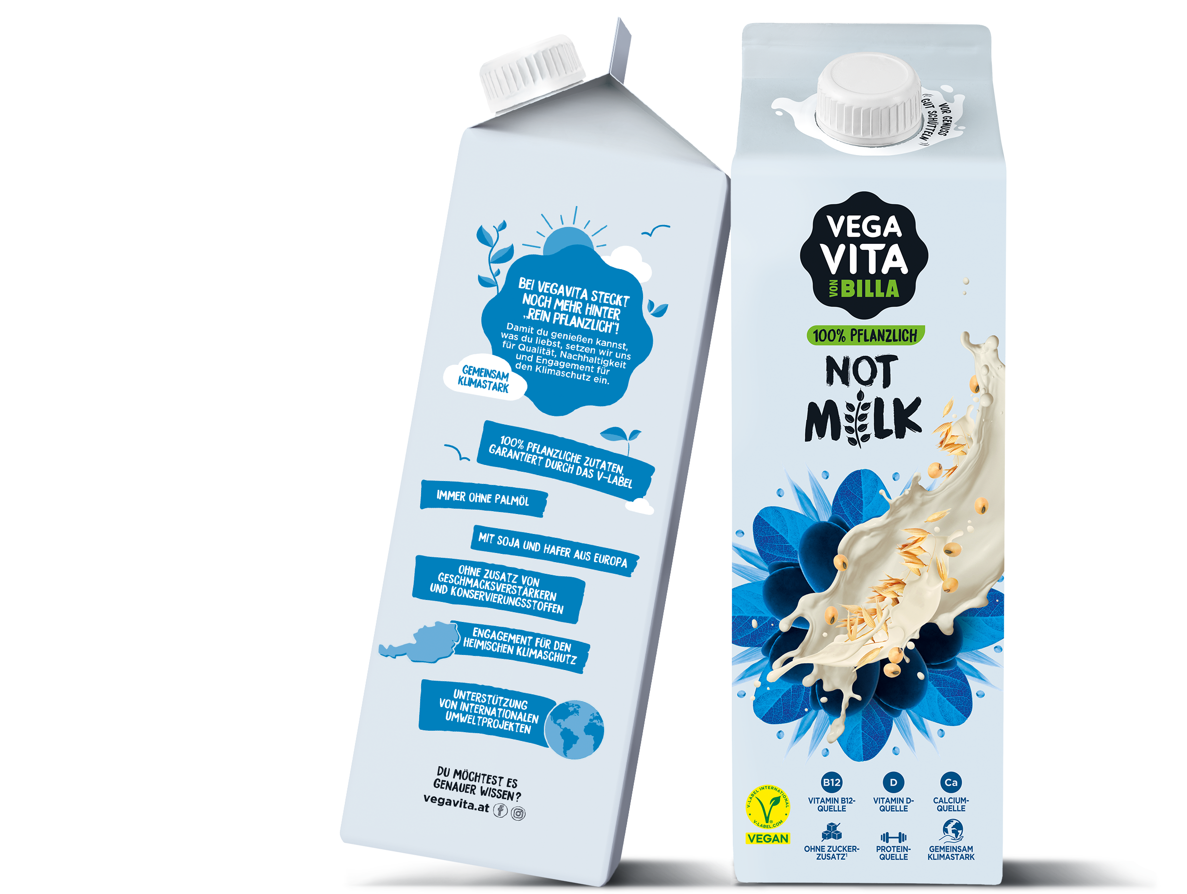
Visually speaking, the new design is a major step. In order to ensure brand recognition, the characteristic flower shape was retained for the new logo. The visibility was enhanced by means of bold colour contrasts.
Iconic and to the point
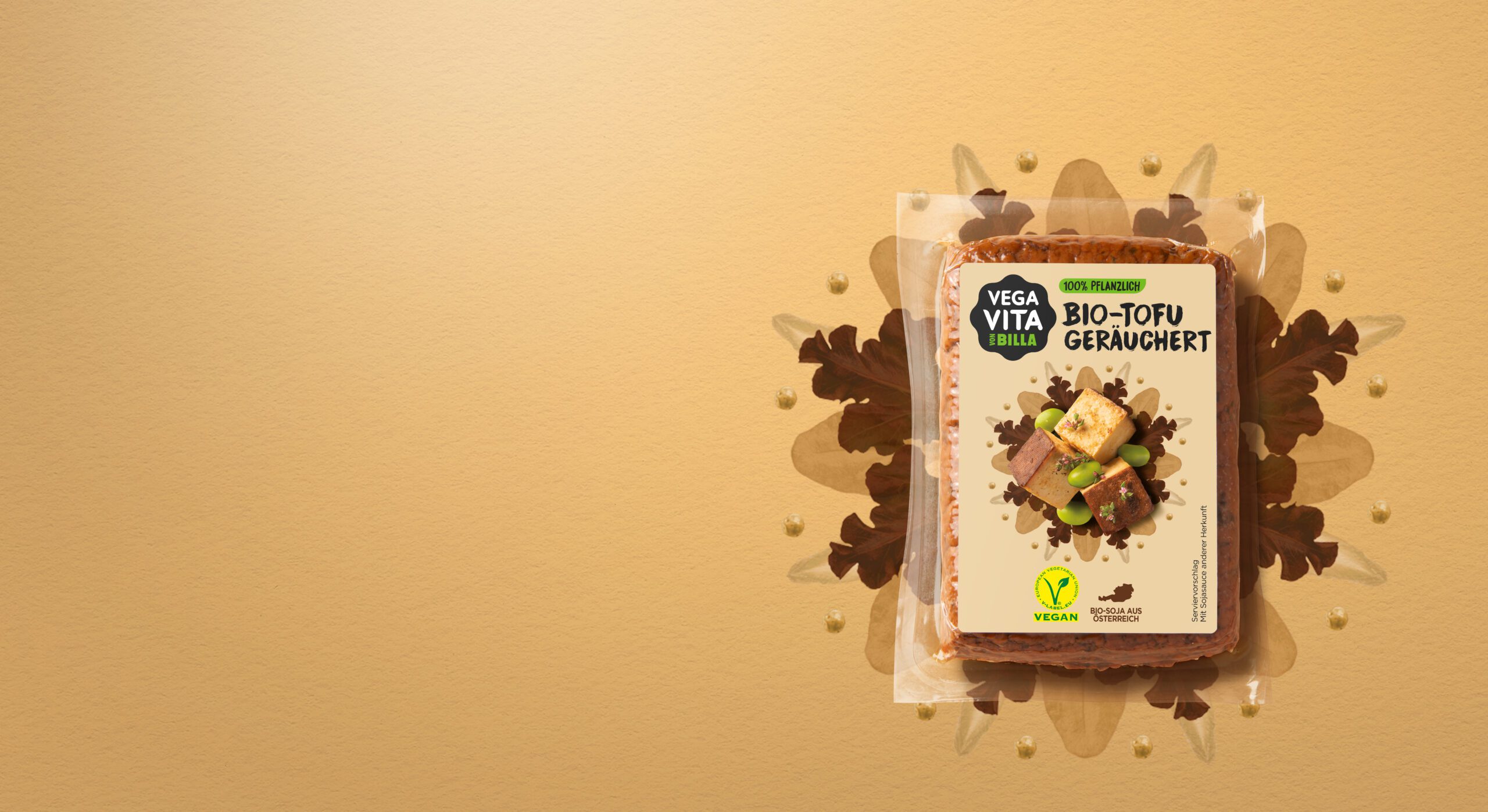
Nowadays, ‘plant-based’ means so much more than just a specific way of eating. This new lifestyle is defined not only by indulgence and taking pleasure in food, but also by the responsible use of our planet’s resources, along with respect for people and animals. Our creative concept, a mandala skilfully composed of plant-based elements only, conveys the essence of harmony and zest for life at first glance.
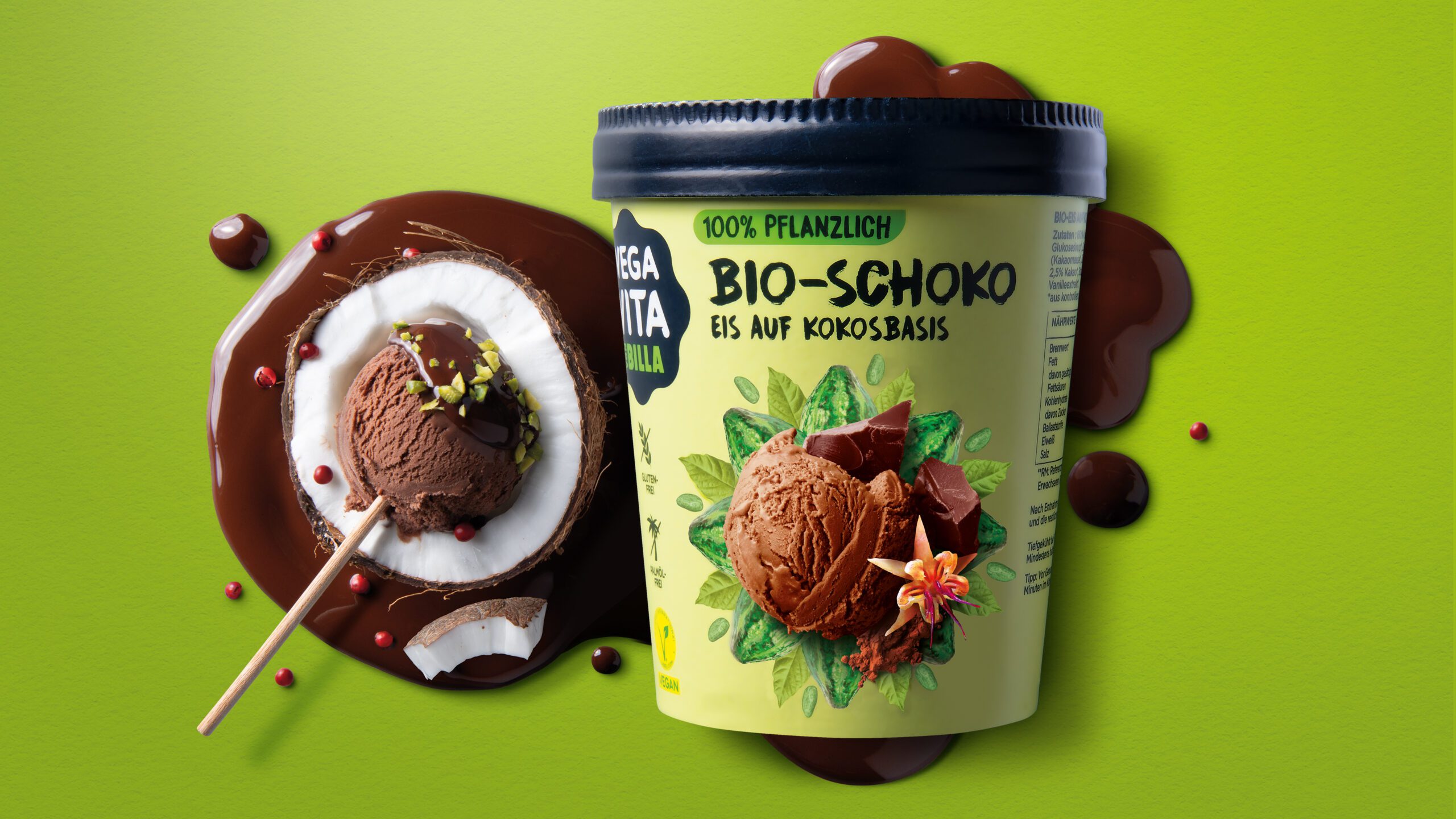
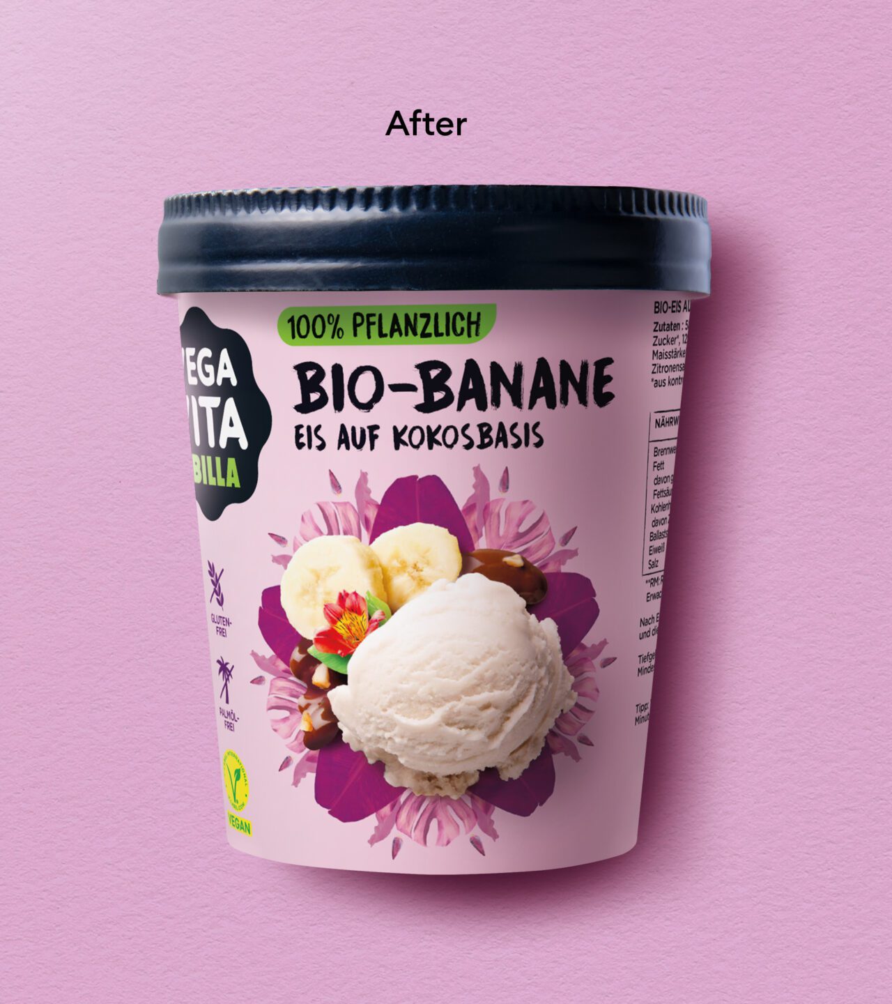
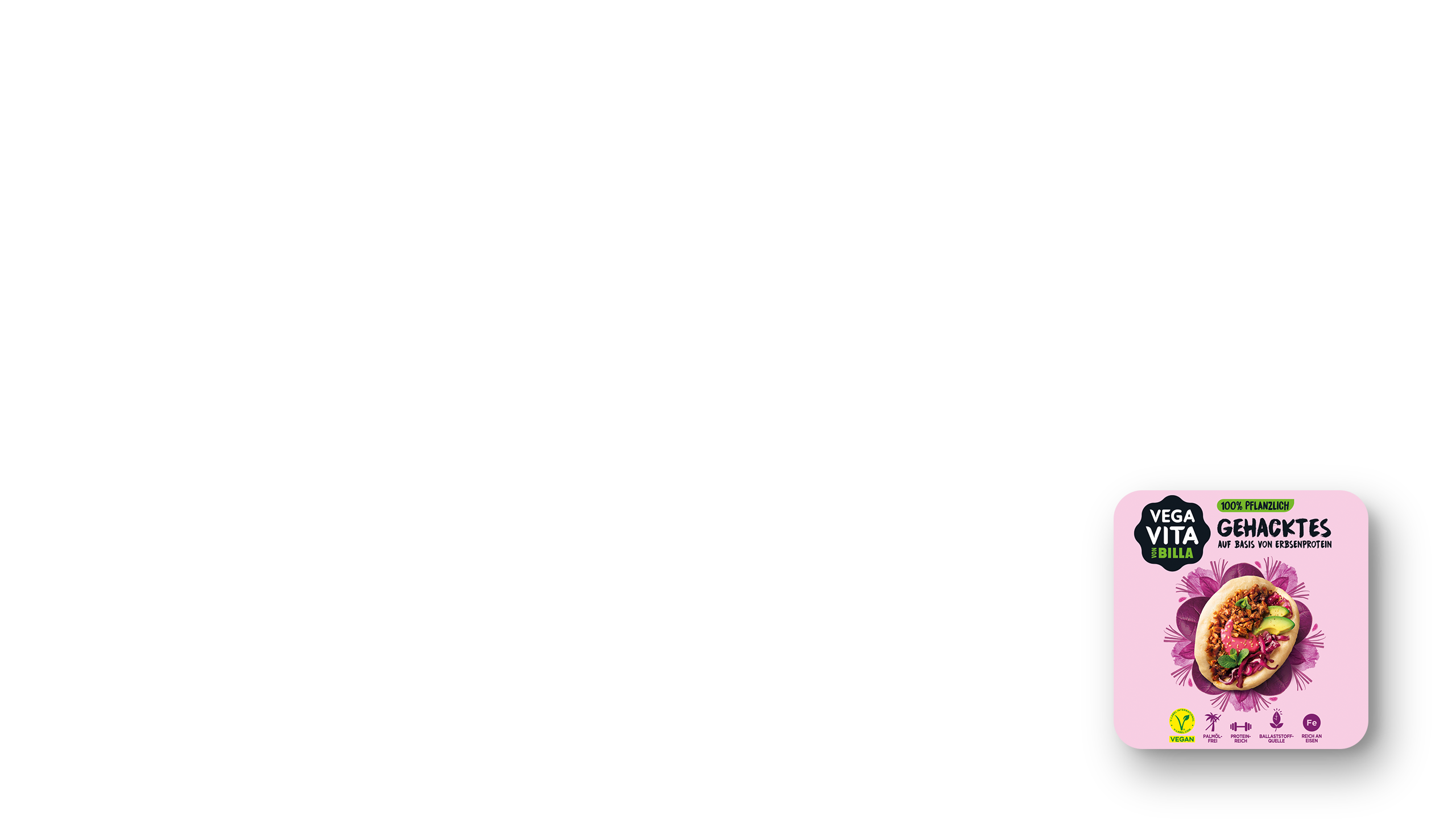
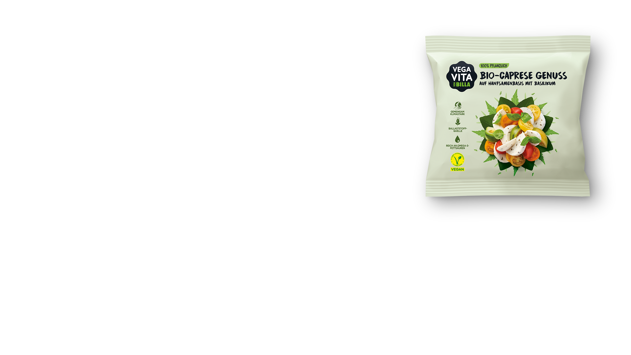
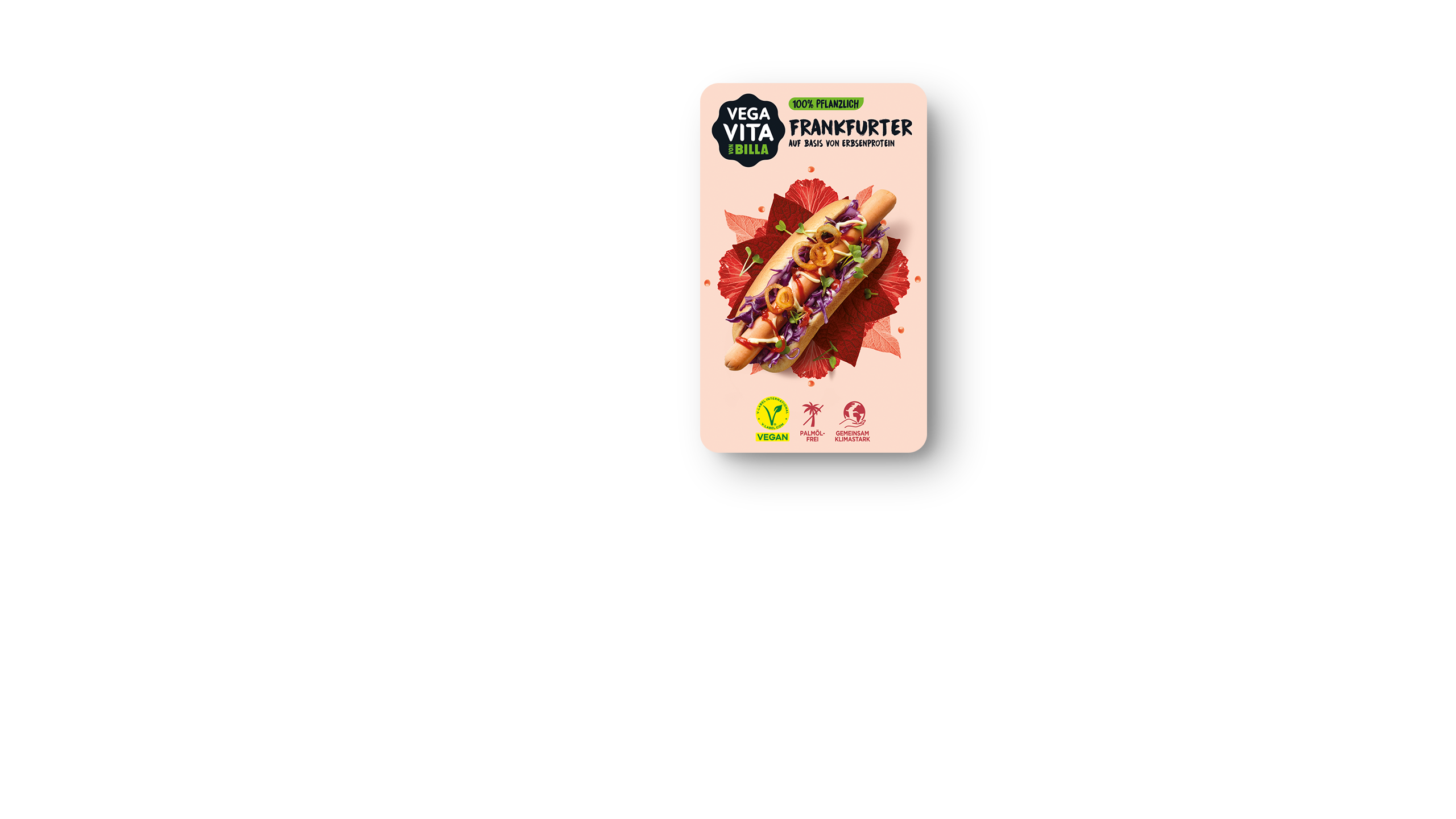
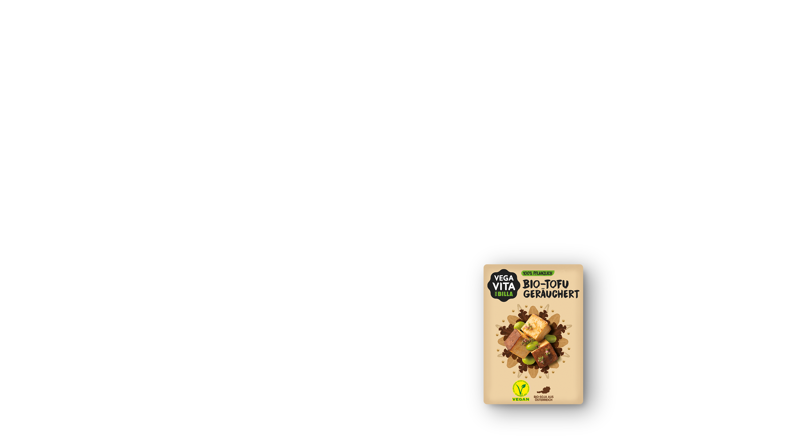
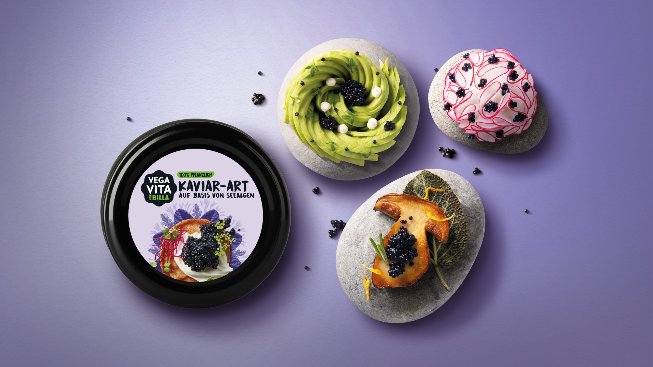
Strikingly culinary
With a central position on the packaging, the mandala, individually composed and colour themed for each variety, makes every product unique. This not only sets the food shot perfectly in scene, but also ensures easy differentiation between varieties, as well as culinary appeal and a strong presence on the shelf.
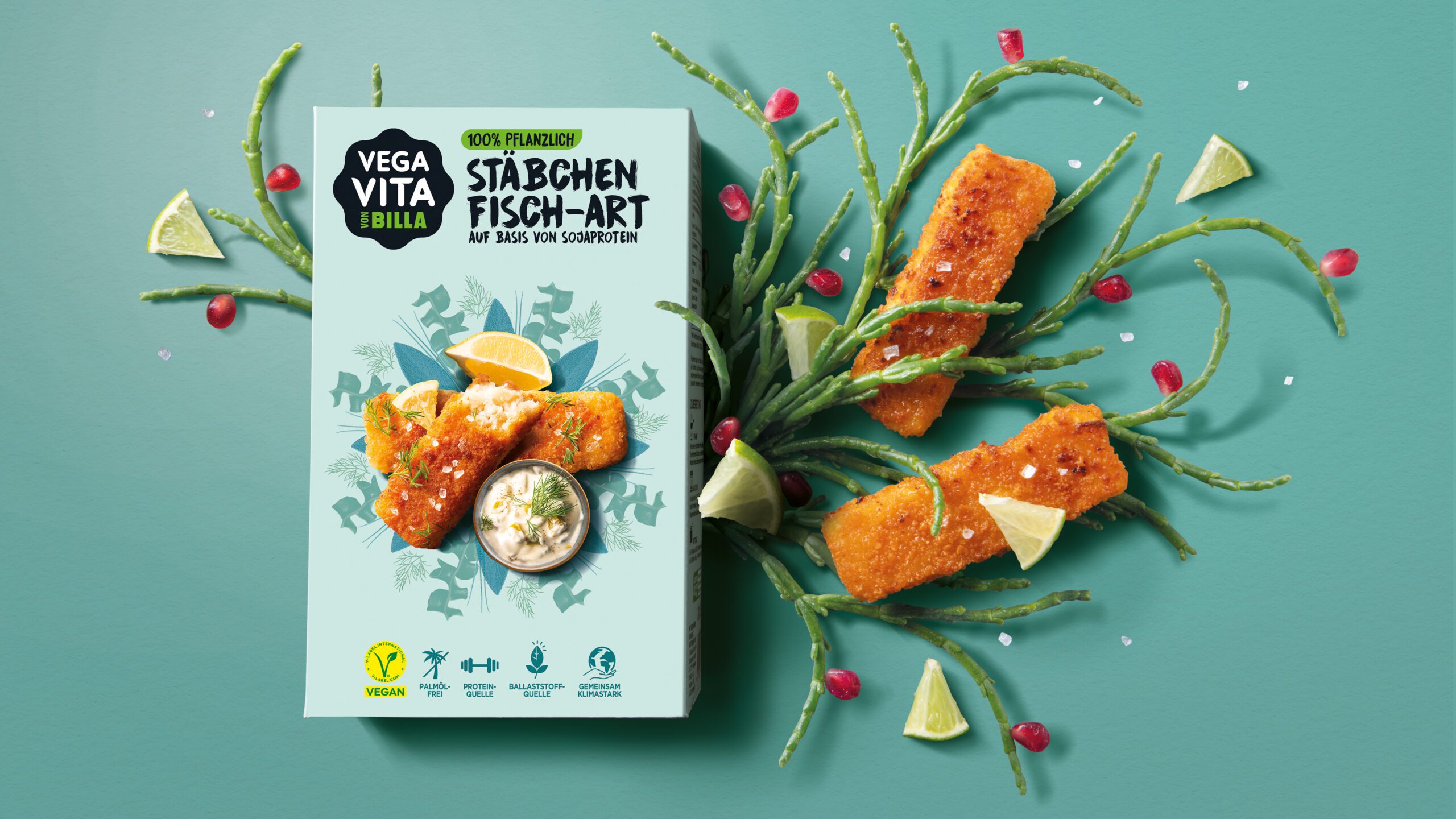
Food photography
Our many years of experience in food styling and photography result in irresistible food shots. Selection of the right ingredients, perfect preparation of the appropriate recipe and effective composition make all the difference.
Color means reddot too
Vegavita proudly wins the Red Dot Design Award — celebrating both its bold culinary expression and the smart, streamlined architecture of its packaging. A vibrant tribute to the perfect vegan lifestyle balance.

Captivating stories
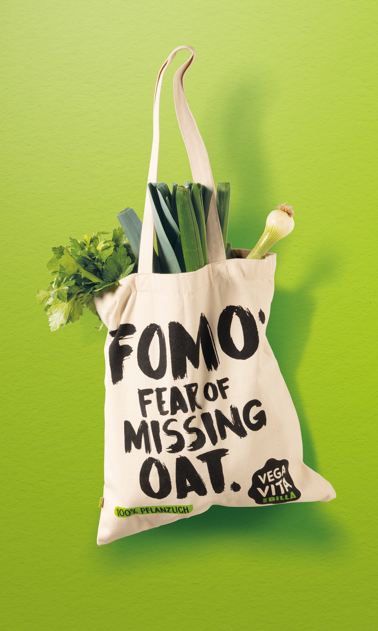
The new brand language, created from graphic elements and a typography strong in character, was developed into storytelling, so as to make the relevant content eye-catching, interesting and pleasantly readable, while also reinforcing the brand’s identity.
A wide Range
The outcome is a clear visual segmentation of a broad portfolio that comprises over 150 colourful products and various product sub-ranges generating the immense desire to be tasted.