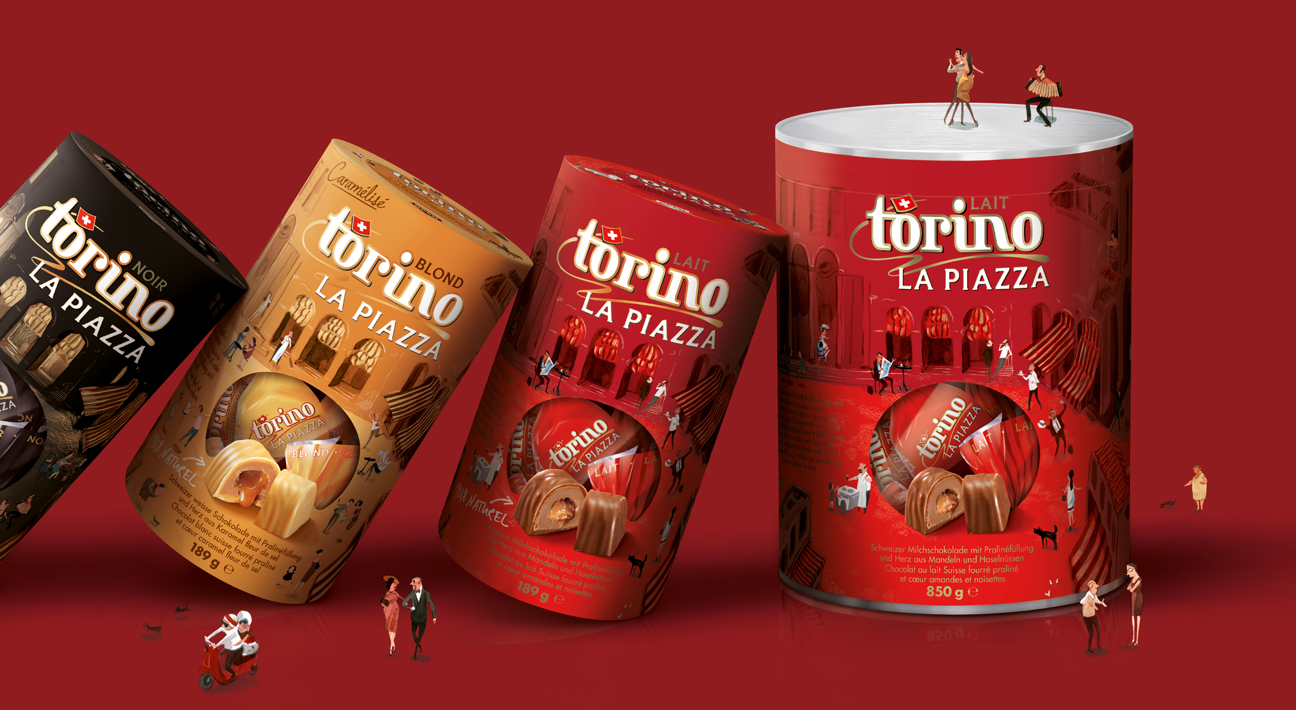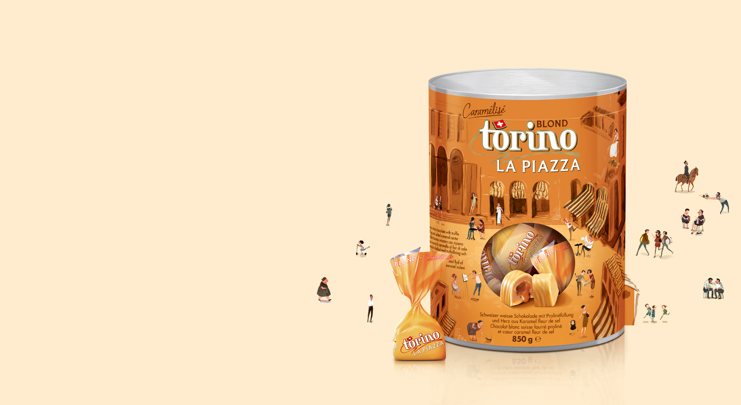
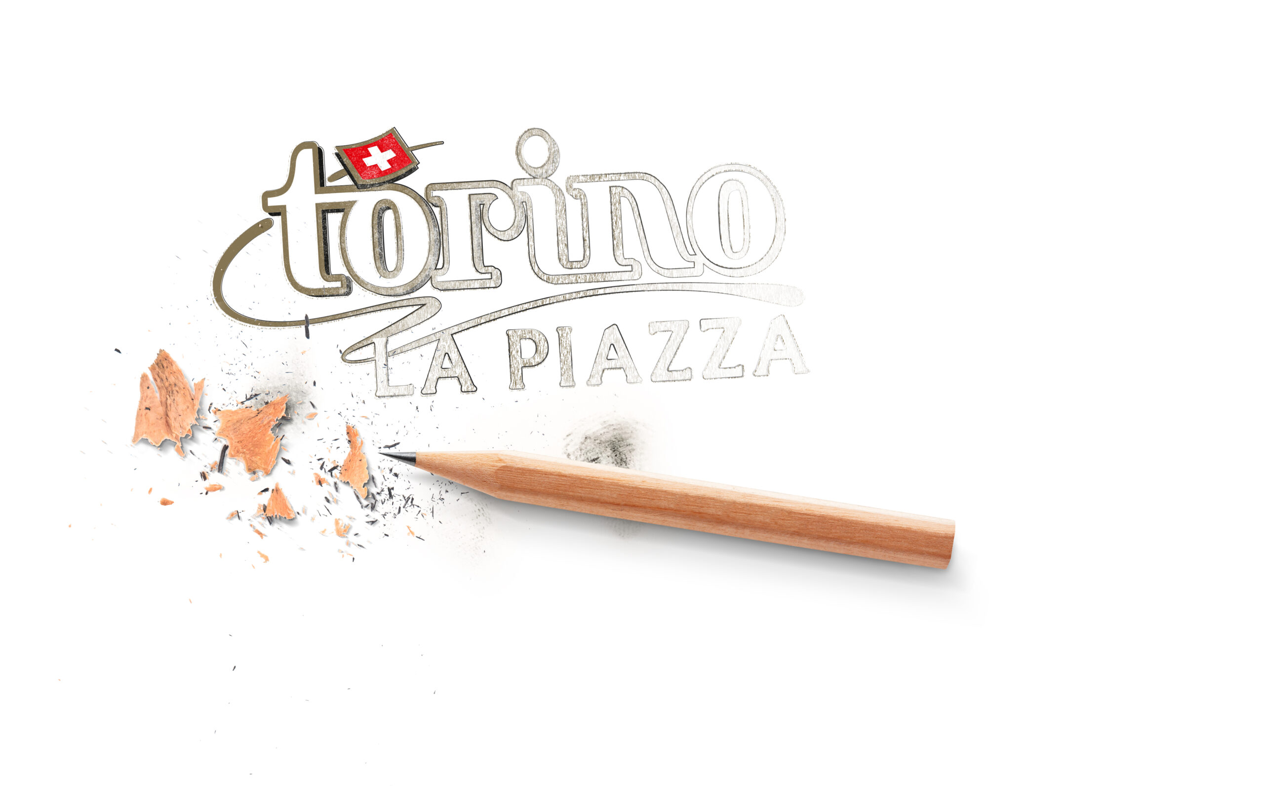


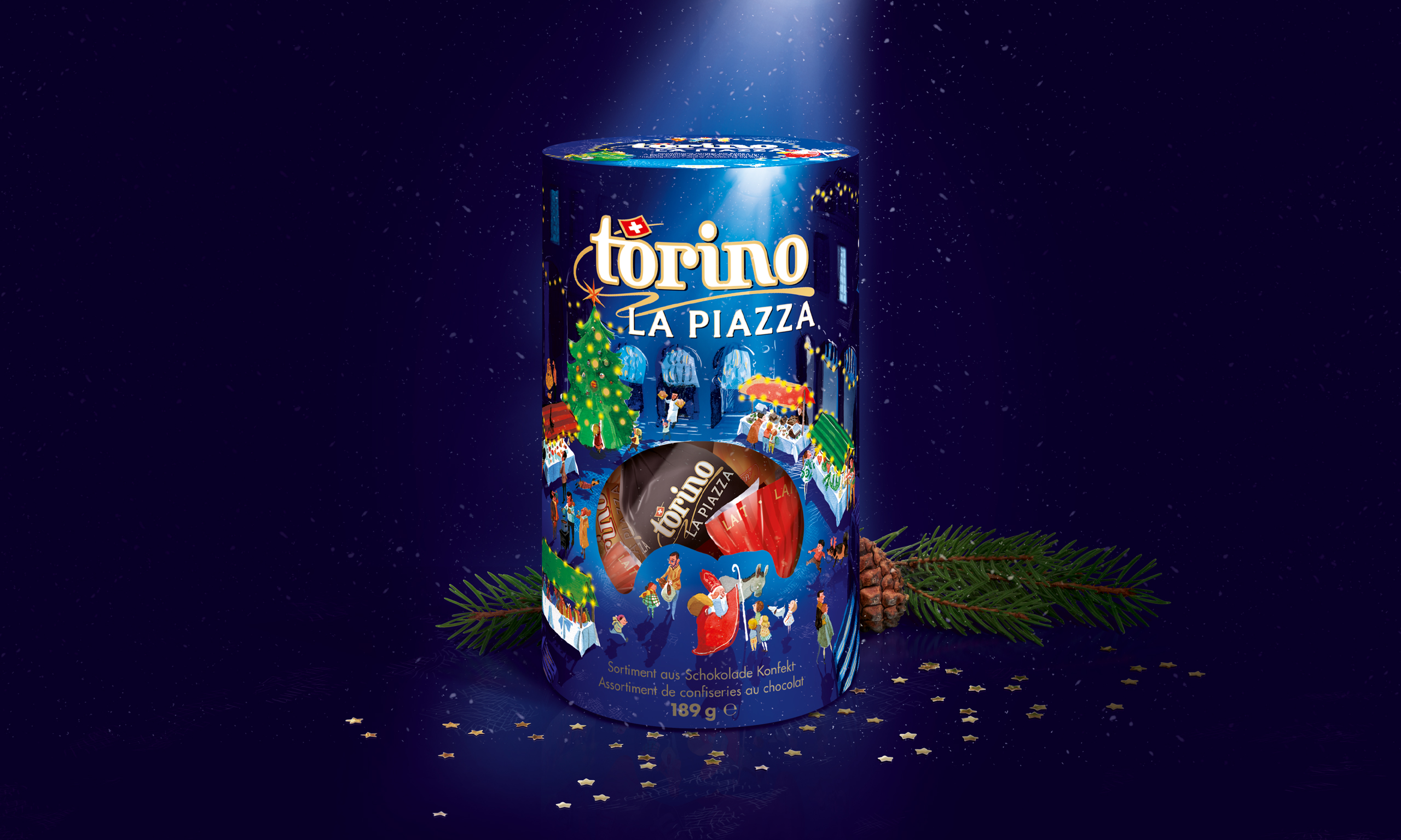
Creating magic
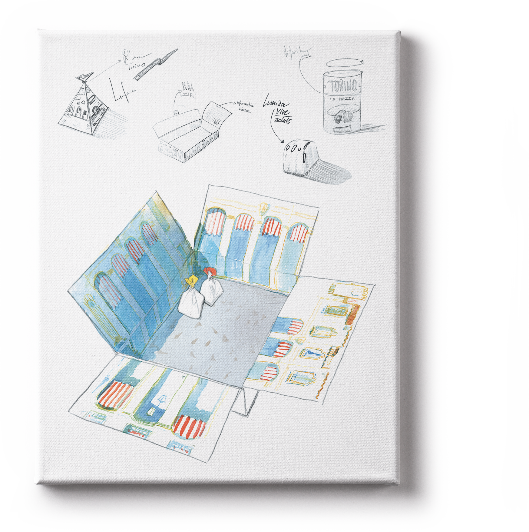
For this special edition, we were asked to create a packaging with a unique concept, that could be translated in multiple varieties, for both the main packaging & portion packaging.
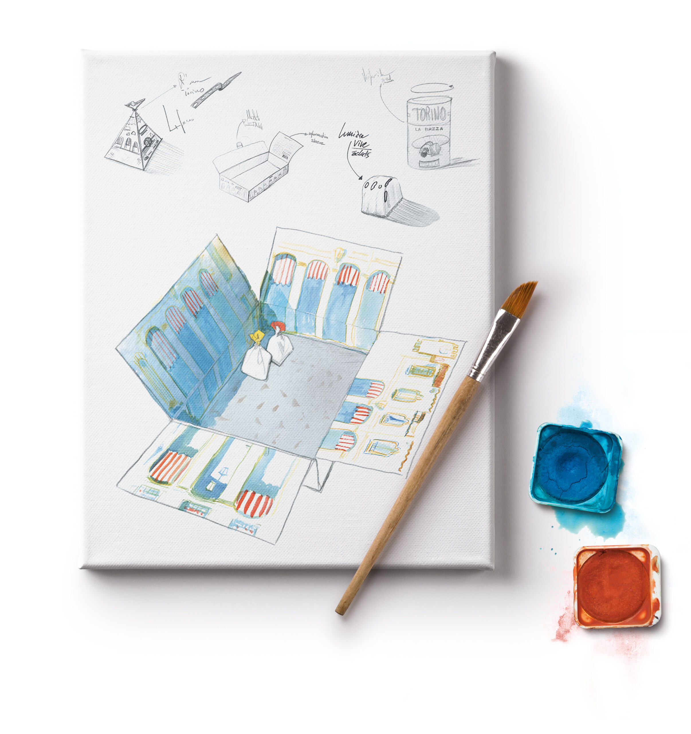


Finding the right style
We explored various ideas and worked on many illustration styles to select an exclusive design. We collaborated with a talented illustrator to bring to the project an extra layer of originality.
To preserve this unique illustration style and turn this concept into a successful final product, our designer brought their branding and packaging expertise to the table. We then orchestrated the branding hierarchy, the color management, the food appeal as well as the respectful integration of the illustrations.
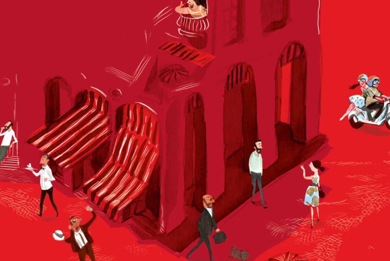
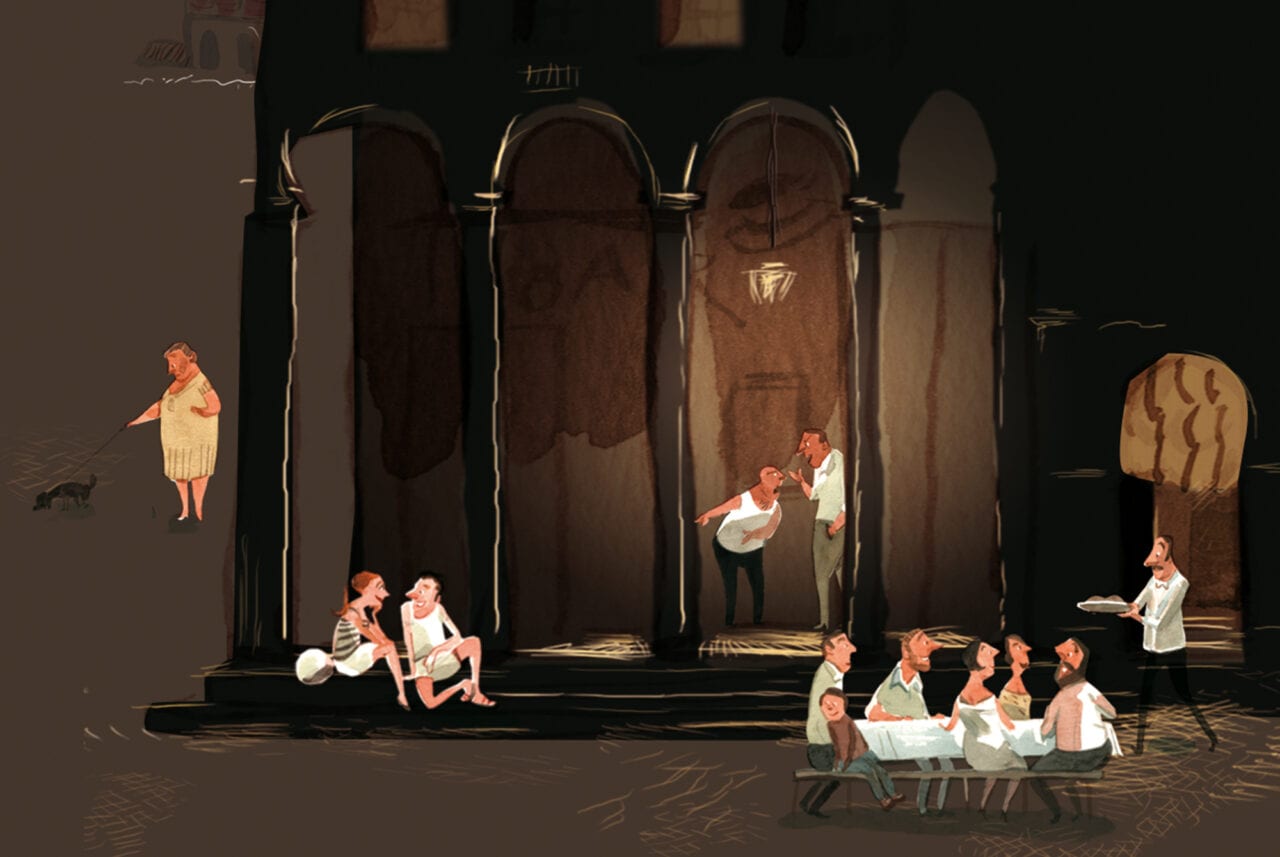
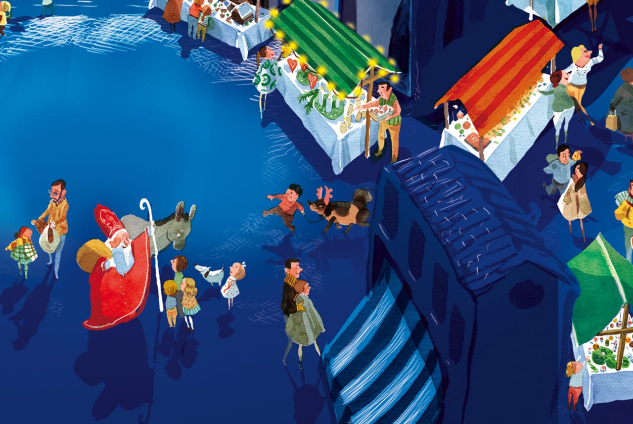
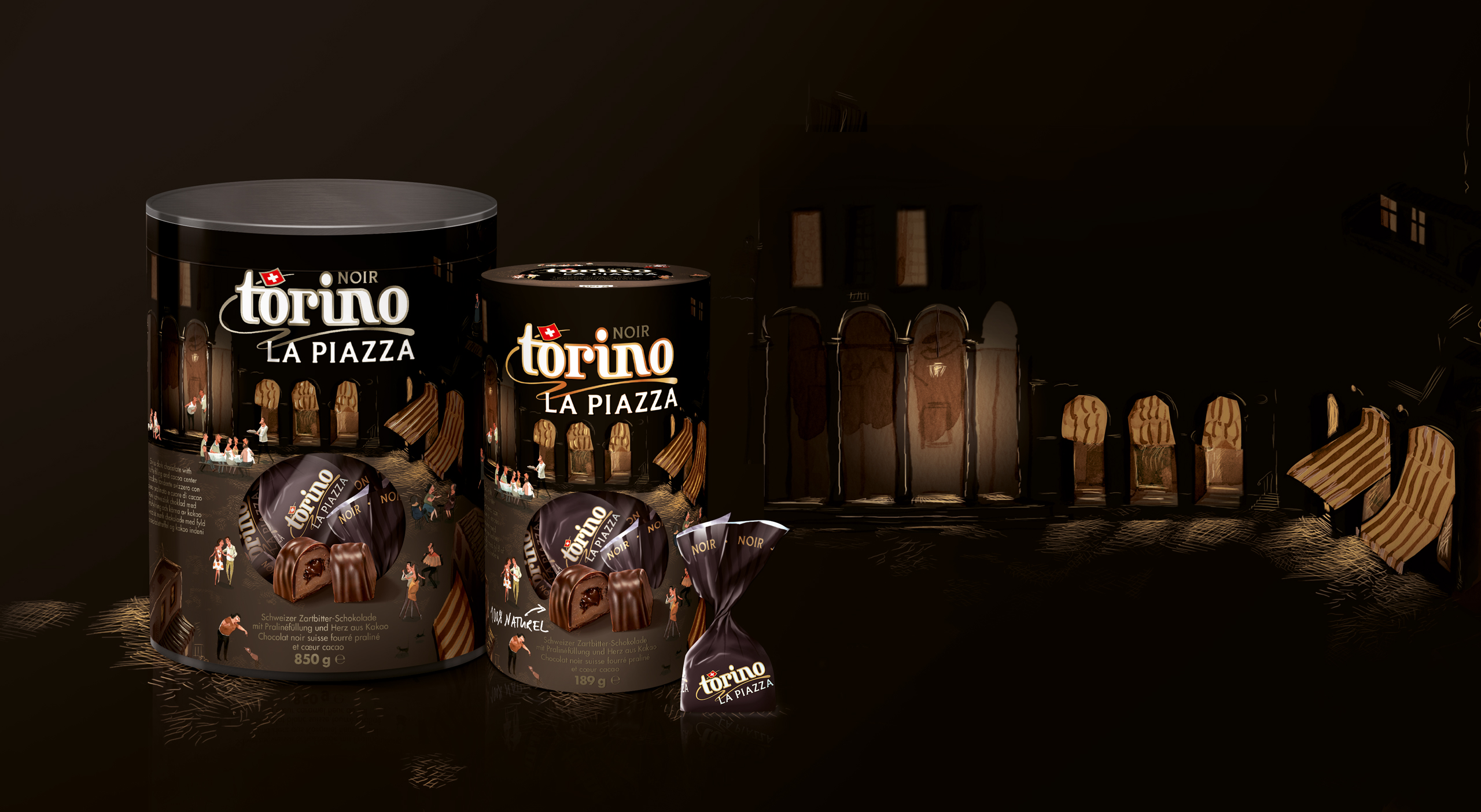
An adaptable concept
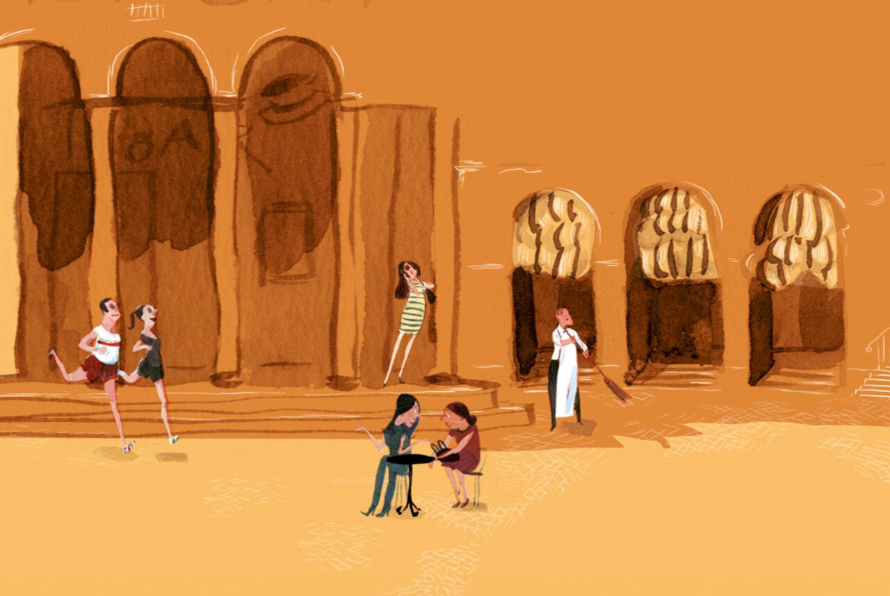
«The Piazza» (square in Italian), a concept first created by our client Camille Bloch, is a place of gathering and life. With a touch of Italian warmth, the consumer can peek into multiple daily stories. We applied the concept for the dark, milk, and blond chocolate, as well as for a mixed Christmas edition.
Bringing joy to people
The illustrations represent the values of Torino. A simple life, happiness and the beauty of little things.
What better gift than a box of delicious chocolate to illustrate those feelings.