200 years of chocolate innovation
Founded in 1816, Menier revolutionised the confectionery industry by pioneering mass-produced premium chocolate and introducing one of the earliest wrapped chocolate bars. From its early days to the present, Menier has remained a symbol of quality and taste, and we were proud to contribute to the next chapter in this remarkable legacy.
– Since 1816 –
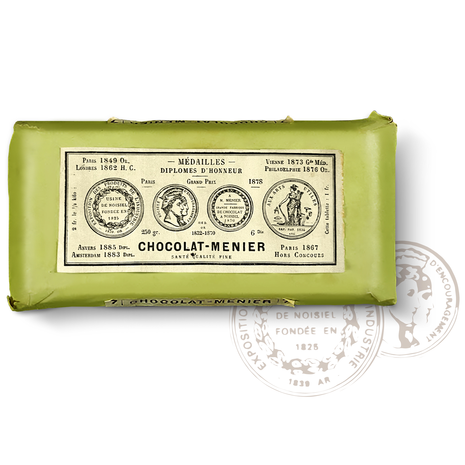

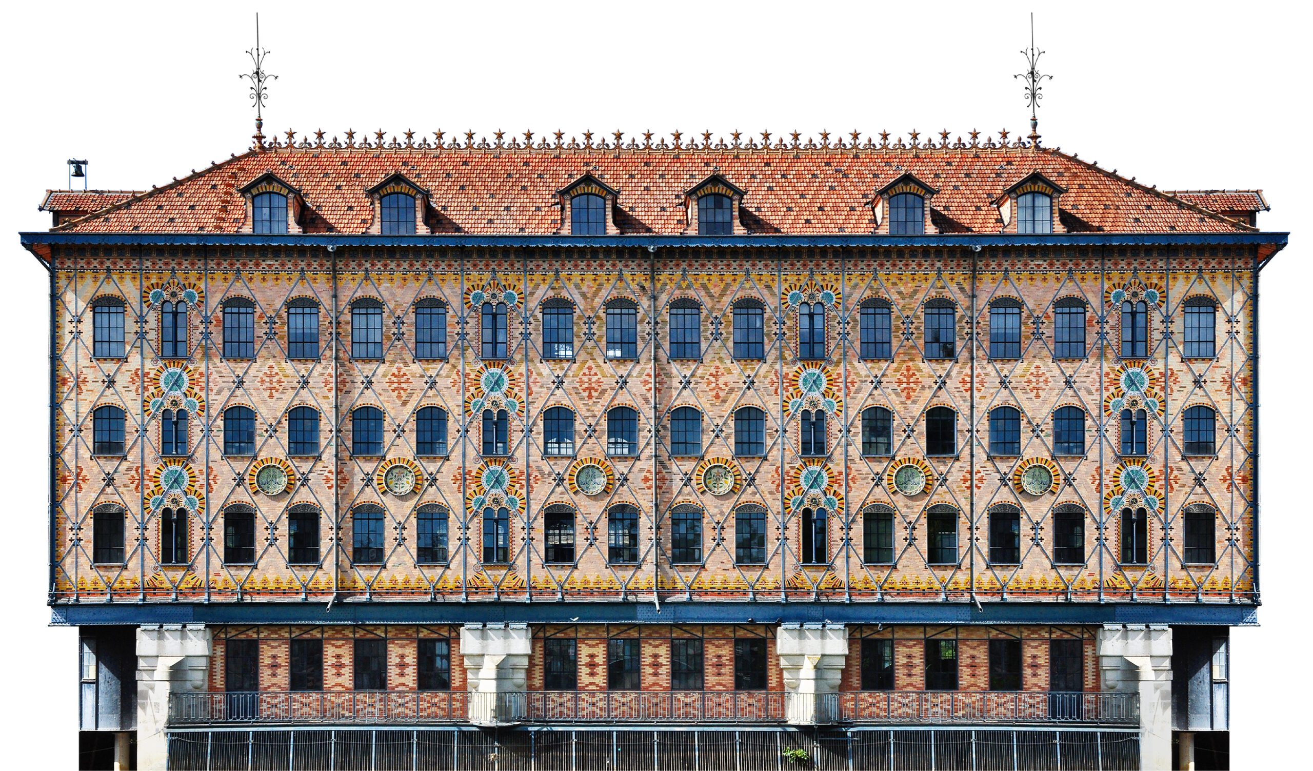
The legend of Noisiel
The iconic Menier chocolate factory in Noisiel, just outside Paris, is a masterpiece of industrial architecture and a UNESCO World Heritage site. Here, the original chocolate bar was born — a packaging design evolving over time, yet still proudly tied to its origins, with historic details like the recognisable medals still unchanged.
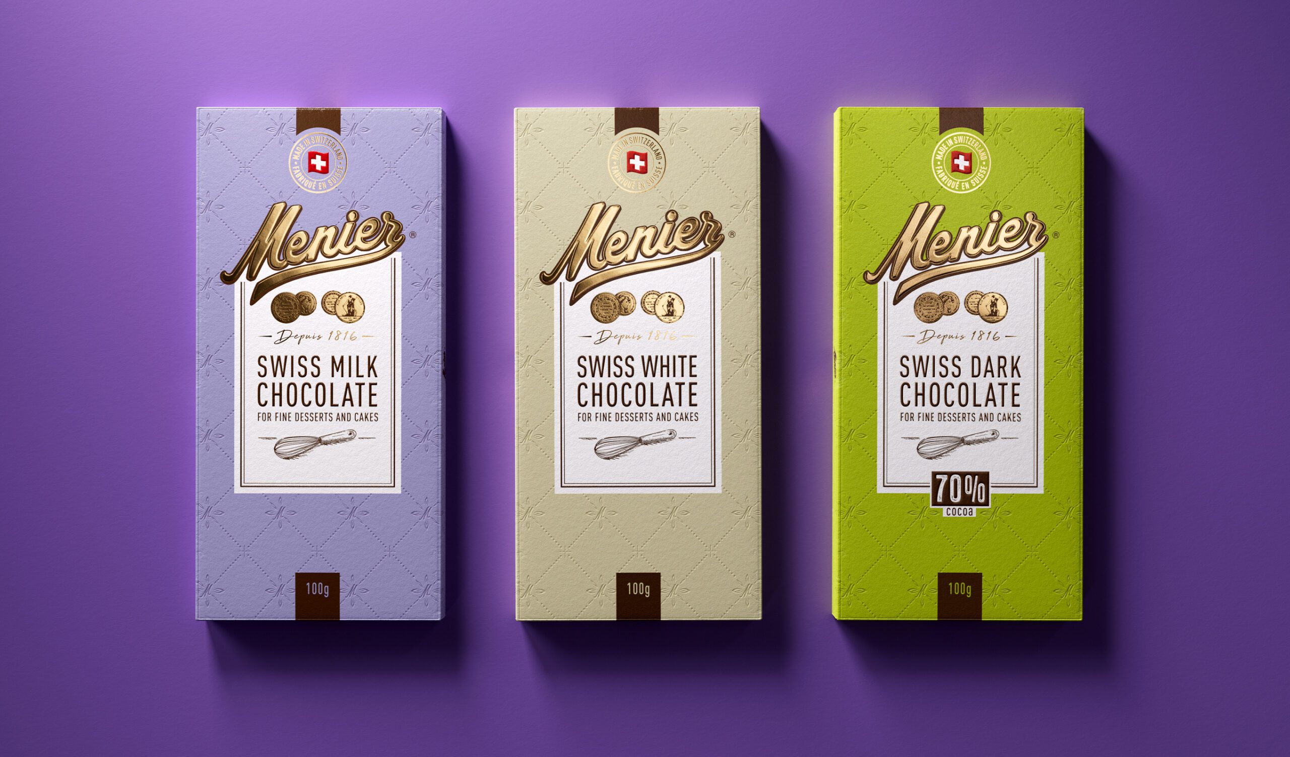
From legacy to shelf impact
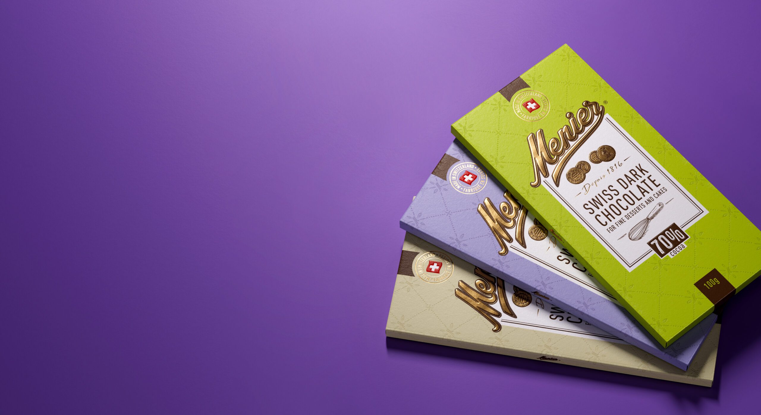
In the UK and across Europe, the brand’s iconic range was ready for a new step: one that brings stronger relevance in the shelf, a broader range of products, and a refreshed design that honours its origins while looking to the future. Now manufactured in Switzerland to the highest standards of chocolate making, Menier blends heritage with precision.


Major UK retailers
Menier chocolate is listed with major UK retailers, including leading supermarkets and online grocers such as Sainsbury’s, Waitrose, Ocado, and Booths. With a clear, contemporary design and premium positioning supported by a focused category strategy, the redesign has helped reinforce Menier’s visibility in the chocolate segment and support its position within a highly competitive market.
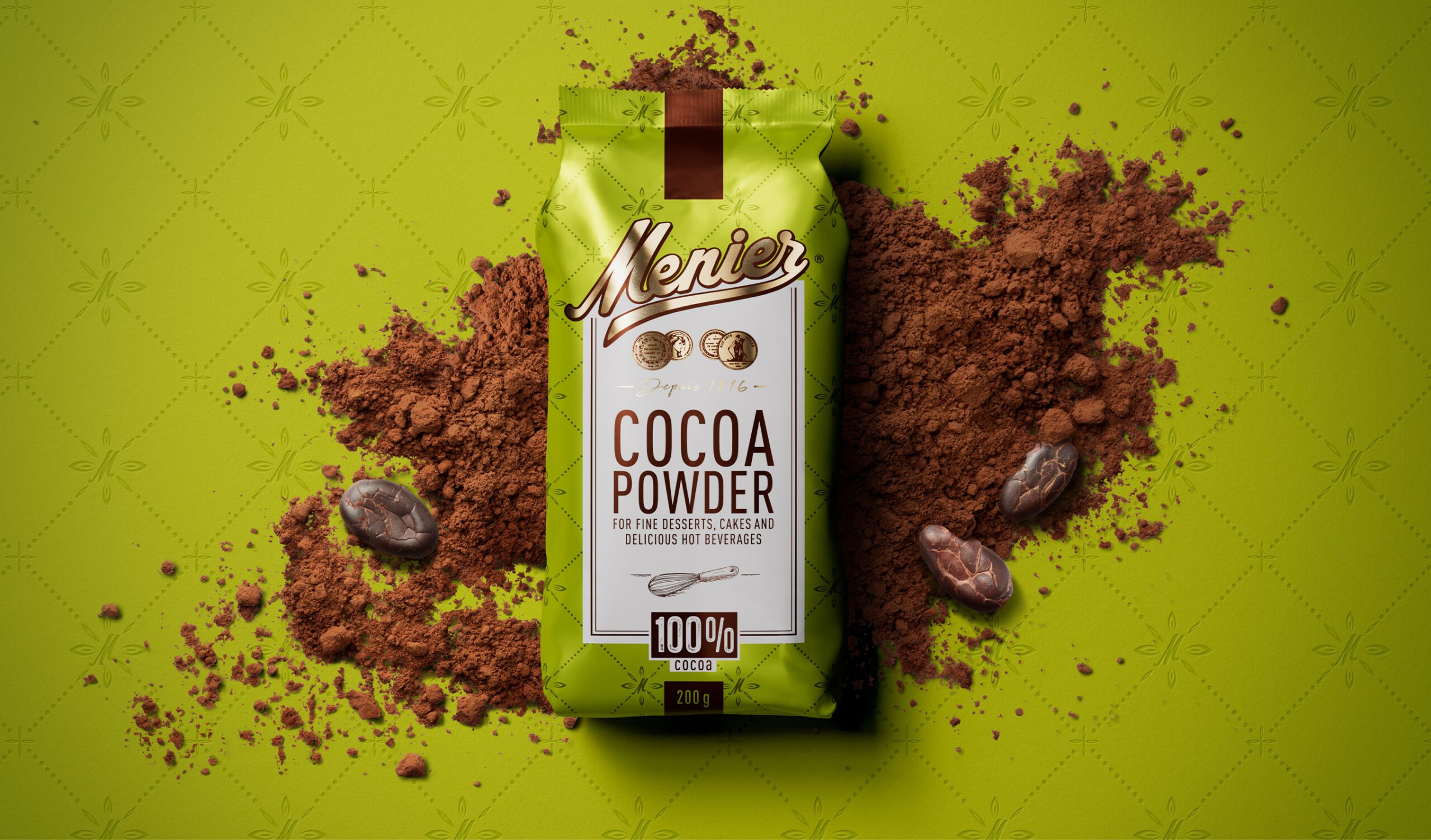
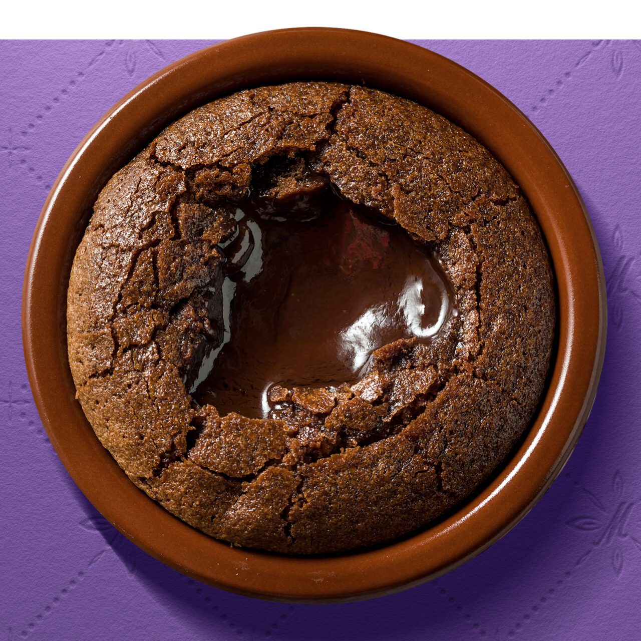
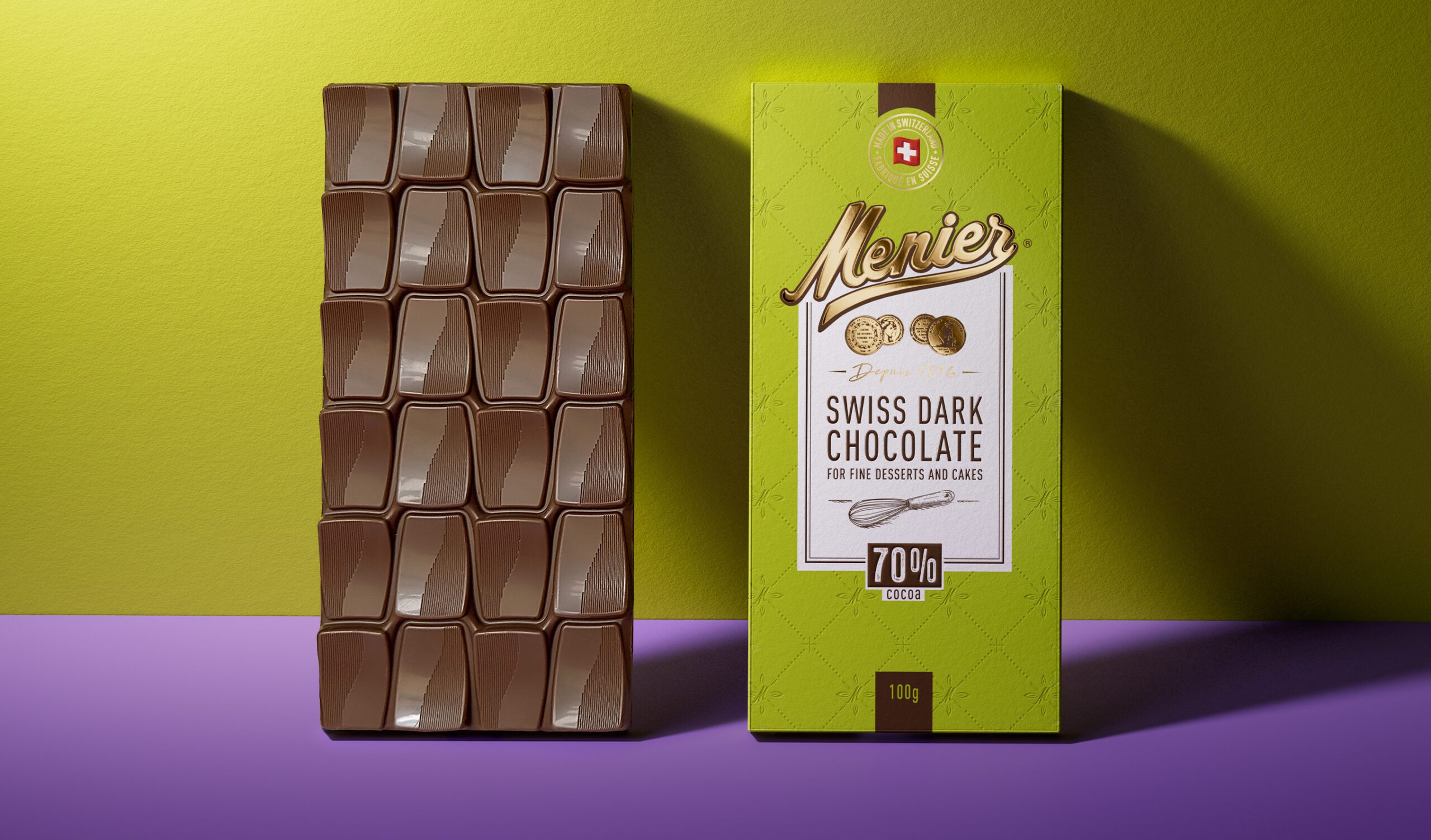
Designed for baking excellence
Known for its quality in cooking and baking, Menier has earned the trust of professional chefs and home bakers around the world. Its chocolate consistently delivers outstanding results in the kitchen, making it the chocolate of choice for those who take baking seriously. This culinary credibility played a key role in the redesign — helping the brand define its own territory and grow its success as a trusted name in the premium chocolate category.
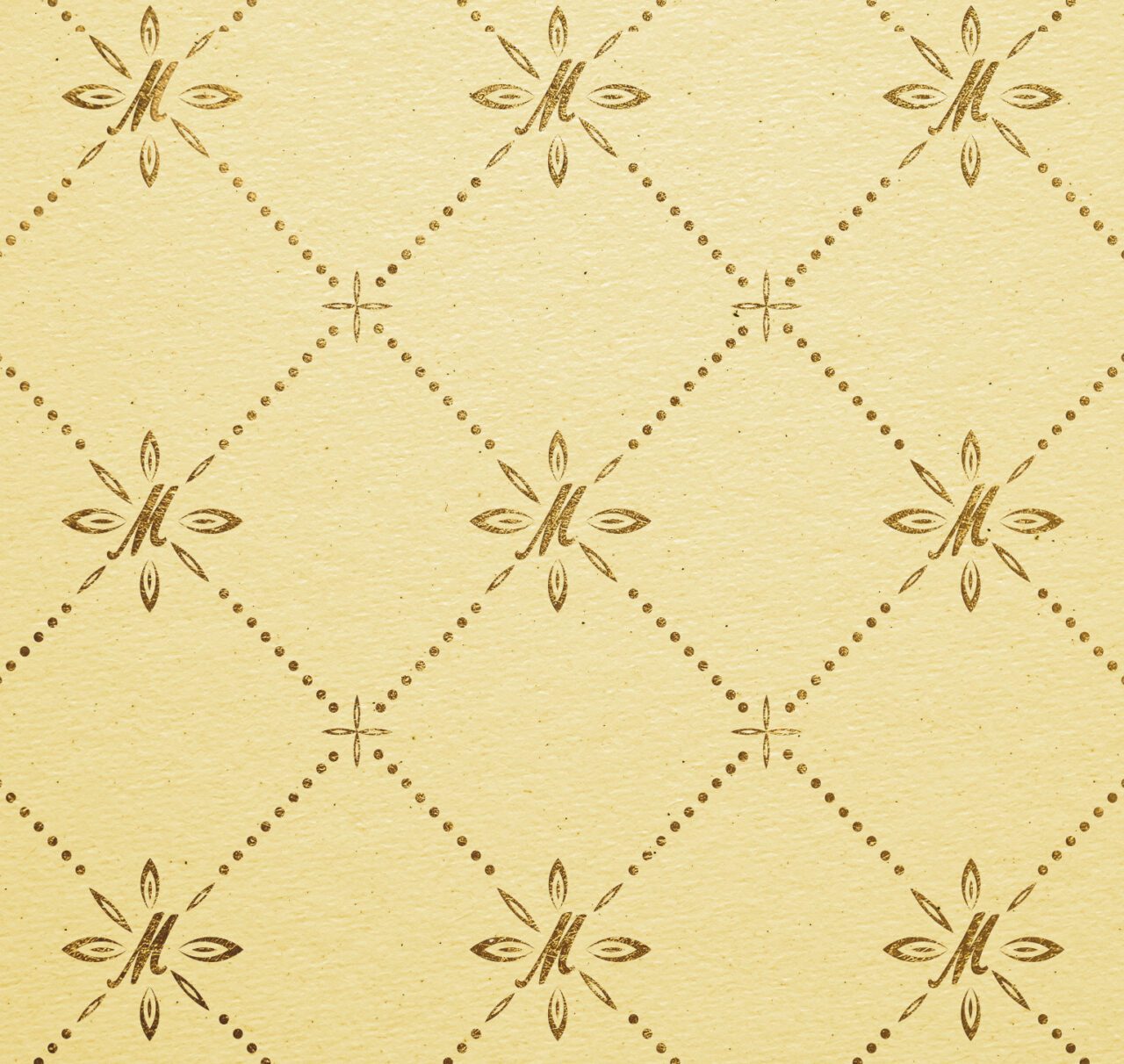
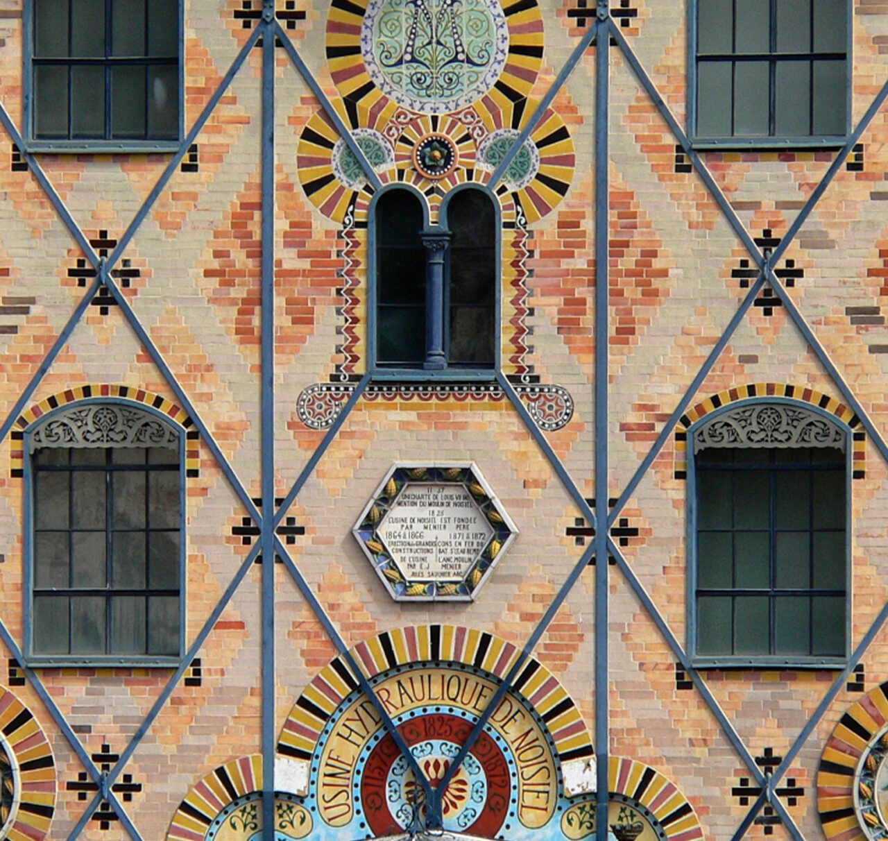
Where inspiration takes shape
Working on the redesign, we drew inspiration from the Menier factory, particularly its distinctive iron framework and geometric facade. These architectural details became the foundation for a tailor-made pattern used across the packaging range. Minimal and structured, it brings a visual depth and a quiet nod to the brand’s origins, while supporting the clean, modern layout.
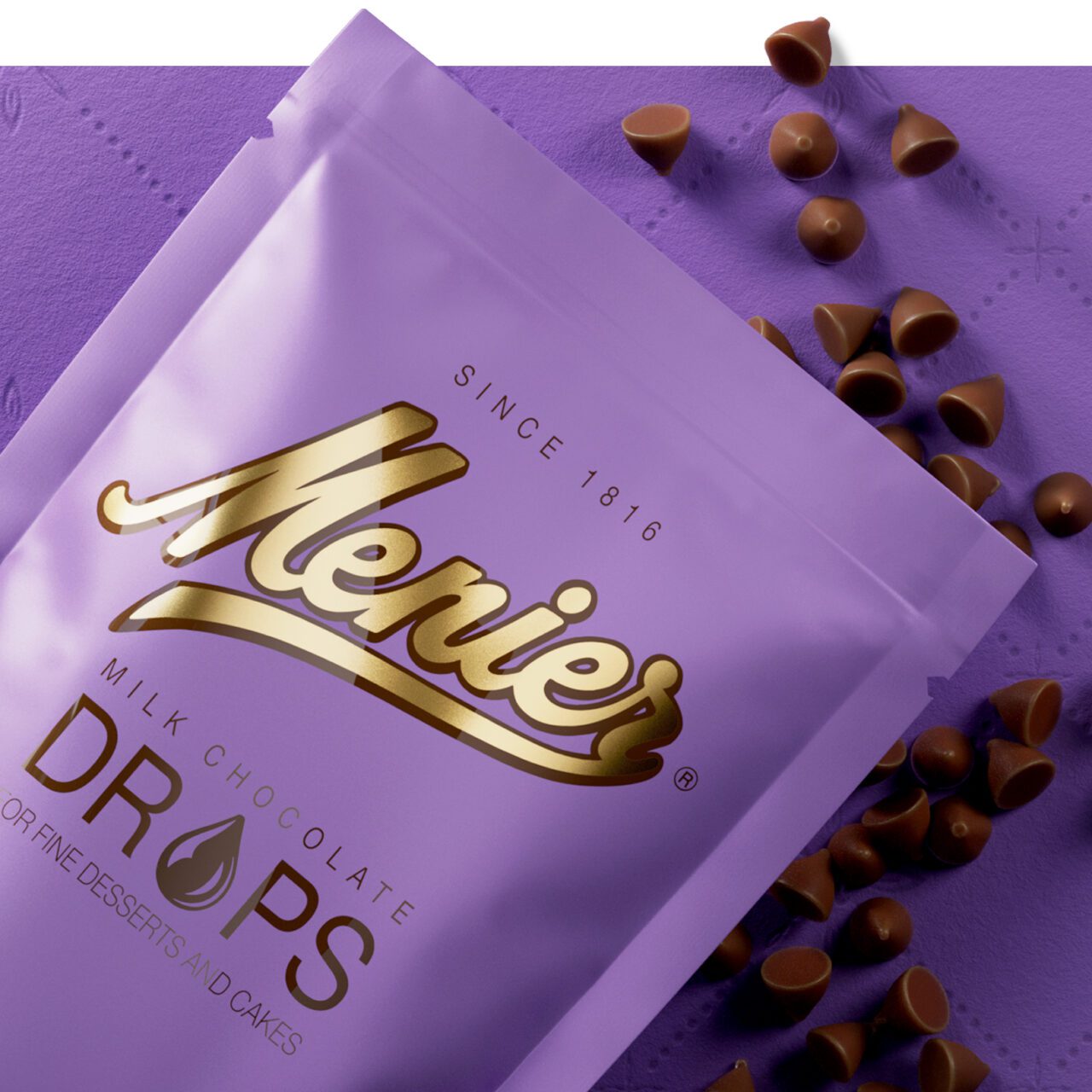
Attention to detail
Every detail of the new design was carefully considered to respect Menier’s iconic packaging while giving it a modern, minimal expression. Key brand elements, including the logo lettering, iconic medals, and signature pattern, were refined to enhance recognition, highlight premium quality, and ensure consistency across the range.